The Brand
Who we are, what we stand for and how we sound. The website at sim.org.nz is the master application of this brand: when in doubt, match it.
Our story
SIM began in 1893 as the Sudan Interior Mission and grew into a global mission working in over 70 countries. The name we carry now, Serving In Mission, holds the conviction that started it: no one should live and die without hearing the gospel of Christ.
SIM New Zealand traces its roots to Kiwi missionaries who answered God's call in places like Bolivia in the early 1900s. We still mobilise and equip New Zealanders for cross-cultural ministry. Here at home, we partner with the New Zealand church to build relationships with people of other faiths and ethnicities for the sake of the gospel.
Friendly.
Authentic.
Reliable.
Grounded.
©2026
What we stand for
Convinced that no one should live and die without hearing God's good news, we believe He has called us to make disciples of the Lord Jesus Christ in communities where He is least known.
Therefore, compelled by God's great love and empowered by the Holy Spirit:
- We cross barriers
- to proclaim the crucified and risen Christ, expressing His love and compassion among those who live and die without Him.
- We make disciples
- who will trust and obey Jesus, and become part of Christ-centred churches.
- We work together
- with churches to fulfil God's mission across cultures locally and globally.
- We facilitate
- the participation in cross-cultural ministry of those whom God is calling.
To see a witness to Christ's love where He is least known, disciples of Jesus expressing God's love in their communities and Christ-centred churches among all peoples. By faith we see:
In the world
- A vibrant testimony to the gospel through character, word and action among communities where currently Jesus is least known.
- Followers of Jesus living out the gospel in unity and in the power of the Holy Spirit, making disciples who trust Him, obey Him and play a full part in church life.
- Churches serving their communities and reaching out with the gospel locally and globally.
In and through SIM New Zealand
- A community growing in faith, in obedience to Jesus and in ministry competence.
- Workers crossing barriers with the gospel, being and making disciples of Jesus, expressing His love and compassion.
- Multi-ethnic and multi-skilled teams serving together in love and harmony.
- Courageous leaders investing in the development of others for life-transforming ministries.
- Effective partnerships with Christ-centred churches and organisations facilitating the spread of the gospel.
In eternity
- The redeemed from all tribes, languages, peoples and nations worshipping the living God.
We are God-dependent, diverse disciples of Jesus in a church-centred and compassionate community.
- Dependent on God
- We are people of prayer. We trust in our faithful God and affirm the truth of the Bible.
- Diverse
- We are one in Christ. We embrace, and are strengthened by, the international, interdenominational and multi-ethnic diversity of His church.
- Disciples of Jesus who make disciples
- We cross barriers to fulfil God's global, urgent and unfinished mission.
- Church-centred
- We are part of Christ's church and together we plant, nurture and equip churches.
- Compassionate
- We are people of love. We humbly offer compassionate, holistic service and eternal hope through the knowledge of Jesus Christ.
- Community
- We live a life of integrity in obedience to God and in relationship with each other as we listen, learn, grow and innovate together under the guidance of the Holy Spirit.
We are the bridge between willing hearts in New Zealand and communities in need of Christ around the world. As the Every Person, we are ordinary people joining God's work, not exclusive experts, and we help every willing person find their place in mission.
Our promise
Wherever God leads you, SIM New Zealand will journey with you.
- Guidance
- From first enquiry to placement, we help people discern their calling.
- Care
- Pastoral and member care for mission workers and their families: emotional, spiritual and practical.
- Integrity
- Transparency, prayerful dependence on God and good stewardship.
- Collaboration
- Hand in hand with sending churches and global teams, so everyone we send is well supported.
How we sound
Our archetype is the Every Person. All people are equal in value and dignity, and we celebrate everyday heroes: ordinary people joining God's work.
- Friendly and approachable
- A humble friend or neighbour, never corporate or preachy, so everyone feels they belong.
- Authentic and honest
- Real stories of struggle and hope, told in genuine language rather than buzzwords.
- Reliable and supportive
- A dependable guide who shows up consistently, without flashiness or pretence.
- Innovative but grounded
- Creative and moving forward, yet steady and practical, like a trusted friend with new ideas.
Warm, plain and hopeful. We write as we would speak to a friend: as "we" and "you", in the active voice, with everyday words and any theological or technical term explained. We acknowledge the hard parts before pointing to hope and the next step. We put what God is doing ahead of what we have achieved.
- Say
- "We know moving overseas can be hard. We are here to support you at each step."
- Not
- "Global mission is easy when you have faith, just go for it."
- Say
- "We're excited to journey with you."
- Not
- "SIM is excited to provide guidance."
- The test
- Does this sound like a caring, trustworthy friend who respects me?
- No one should live and die without hearing of Christ
- The conviction behind everything we do.
- We have a place for you
- Every skill, background and season of life.
- Serving together
- With local churches, global teams and supporters.
- Everyday people, eternal impact
- Ordinary believers stepping out in faith.
- Christ's love in action
- Meeting physical needs, such as healthcare and education, alongside spiritual ones.
- Grounded and forward-thinking
- 133 years of SIM and 100 years of SIM New Zealand, still finding new ways to connect people to Jesus.
- By prayer
- Everything we do depends on God's provision.
- Spelling
- New Zealand spelling: organisation, colour, programme.
- Commas
- No Oxford comma: pray, give and go.
- Headings
- Sentence case, including buttons.
- Paragraphs
- Short, three to five sentences, in plain words.
- Lists
- Short parallel points, with numbers for steps.
- God
- Capitalise He, His and Him.
- Te reo Māori
- Where it fits, used respectfully, with the meaning given for a wider audience.
- Inclusive language
- People or humankind, not mankind.
- Acronyms
- Spell out on first use: Serving In Mission (SIM).
- Jargon
- Explain insider words such as deputation or tentmaking, or leave them out.
- Mission workers
- Mission worker or mission partner in our own voice. Missionary only in historical stories and where people search for it.
- Scripture
- NIV or ESV, cited with the version: John 3:16 NIV.
- Proofreading
- Have someone check anything important.
Messaging in practice
Where the brand work has landed on sim.org.nz and in Together magazine. Open a topic to see the lines, words and checks we use.
Lines we use
Lines that have landed on sim.org.nz, in print and in Together magazine. Reuse them before writing new ones.
- Take the gospel to places Jesus is least known.
- Website home page and x-banners
- Find your place in God's story.
- Postcards, pull-up banner and trifold
- You don't have to go at it alone.
- Website home page and festival poster
- Because Jesus transforms lives.
- Why mission, on the website home page
- God uses ordinary people in extraordinary ways.
- Explore mission
- Stay connected with mission.
- Website, A5 flyer and email template
- By prayer
- Purpose page, 100 Hours for 100 years and Together 188
- Together in mission.
- About us, with “Partners in the harvest” on Donate
- Convinced that no one should live and die without hearing God's good news.
- Trifold, x-banners and presentations
- 70+ countries, 4,000+ workers, 300+ ministries, 133 years
- X-banners and presentations
From proposal to practice
How the 2023 brand strategy and the first guide have been expressed since.
- The Every Person archetype
- “God uses ordinary people in extraordinary ways” on the website and “ordinary people saying yes to His mission” in Together 189
- We have a place for you
- “Find your place”, “What's my fit?” and “Discover your part in His redemption story”
- No one should live and die without hearing of Christ
- “Take the gospel to places Jesus is least known”
- Serving together, a globally led family
- “Together in mission”, “Partners in the harvest” and the Stronger Together partnership pack
- Support from preparation to after service
- “You don't have to go at it alone” and “we walk alongside you from the first step”
- Many ways to serve
- Teams, short term, long term and medical electives, “for your specific commitment level”
- Christ's love in action
- “Because Jesus transforms lives” on the website and “See how Christ's love restores dignity in practical ways” in Together 188
- A rich history of impact
- “100 year legacy”, “Unshakable conviction” and “The journey continues”
- Prayer and dependence
- “By prayer”, “Pray with purpose” and “Choosing to pray” in Together 189
- Friends having a conversation
- FAQs in the reader's own words, such as “Am I ready to go?”, each answered with a next step
Calls to action
Short, sentence case and starting with a verb or in the reader's own voice. Offer one clear next step and invite people to pray, give or go.
- Serve with us
- The main invitation to go
- Explore mission
- A first look for anyone curious
- Talk to a mission coach
- The most personal next step, with one of our mobilisers
- Book a discovery session
- Explore mission
- I'm ready to apply
- Serve with us, alongside “I'd like someone to pray with me”
- Book a partnership call
- Churches, alongside “Invite a mission speaker”
- Choose your prayer time
- Prayer days
- Get this issue and subscribe
- Together magazine
- Start the conversation
- Contact, with “Let's connect” in print
Words we use
- Least known
- “Places where Jesus is least known” in our own voice, “least reached” in stories and “unreached” beside statistics.
- Mission worker
- Mission worker or mission partner. Missionary only in historical stories and where people search for it.
- Mission coach
- Our mobilisers, as people meet them on the website.
- Cross barriers
- With “make disciples”, straight from our mission. Use them as written.
- By prayer
- SIM's motto, in quotation marks when quoted.
- Aotearoa
- Beside New Zealand where it fits, with te reo Māori used respectfully.
- God
- He, His and Him, capitalised.
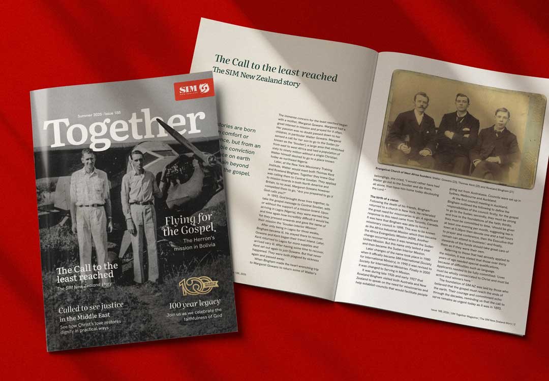
Together magazine
- Headlines are short and human: “Counting the cost of commitment”, “Choosing to pray”, “Seeds of hope”.
- Standfirsts name the people and the place: “Bruce and Norene Bond in Ethiopia”.
- Scripture appears as a pull quote with its reference.
- Opportunity panels name the role and the place: “Healthcare workers needed in Nigeria”.
- Each issue carries a prayer calendar and closes with “In the next issue”.
Lines we have retired
The 2023 strategy proposed 20 marketing lines. Most read as generic mission language and did not make it into use, so don't bring them back:
- Light up the world with compassion, one life at a time.
- Illuminate lives with the light of compassion and faith.
- Unite hearts and bridge boundaries.
- Discover the spirit of Everyman.
- Nurturing holistic transformation that lasts.
Prefer the concrete, scriptural and plain lines above.
Before you publish a story
- Does it show our dependence on God and on prayer?
- Does it celebrate the person and the local church's part, with no sense of cultural superiority?
- Is biblical truth accessible to every reader?
- Is it clear that Jesus is at work and the Holy Spirit is leading?
- Does it invite supporters to pray, give or go, and to live out mission where they are?
- Do we have permission, and could anything put someone at risk?
Logo
One logo, used the same way everywhere, is how people recognise us at a glance. These rules keep it that way.
The logo

SIM in red with New Zealand in black, beside the symbol: two curling forms inside a brushstroke square. It is our one configuration, used everywhere from the website header to covers, signage and merchandise. Never recolour it outside the colourways below. Never redraw, outline, rotate or stretch it, or add effects.
What the symbol means
Two koru forms intertwine inside the square, one descending and one ascending: God reaching down and humanity reaching up. The square sits at a slight angle for forward momentum, and its brushstroke edge suggests uncovering God's work in the world.
The koru forms are not cultural appropriation. Careful consideration was taken not to align them with any established, culturally tapu shapes or forms.
Wordmark on its own
SIM New Zealand without the symbol is used only with written consent from SIM New Zealand, for items too small for the full logo. It is not supplied in the brand pack.
Construction and clear space
The logo was carefully constructed on a grid of circles and guides, and the space around it is part of the design.
Construction
The top of SIM and the base of New Zealand line up with the symbol's second ring, and the square is turned 10 degrees on the same centre.
Clear space
Keep clear space on every side equal to the height of the symbol, shown as x, measured at the size the logo is used. Nothing sits inside that space: no type, rules, photograph edges or other marks.
Minimum size
30 mm wide in print, 150 px wide on screen.
Logo usage
For accessibility, only ever use the logo in these colour variations, and never place the full-colour logo on Pounamu green or red. On a busy photograph, set it on a solid or semi-transparent panel.
Full colour
The primary logo, on white and light backgrounds.
Full colour on Sand
On the Sand surface used across the website.

White on Pounamu green
For dark panels and dark photographs, as in the website footer.
White on SIM red
One colour, white, on red panels and merchandise.

Black
For logo marquees and limited printing.
White on black
For logo marquees and limited printing.
Favicon and app icon
The symbol appears on its own only as the favicon, app icon and social media avatar.
 48 px32 px16 px
Logo downloads
100 Years in Mission
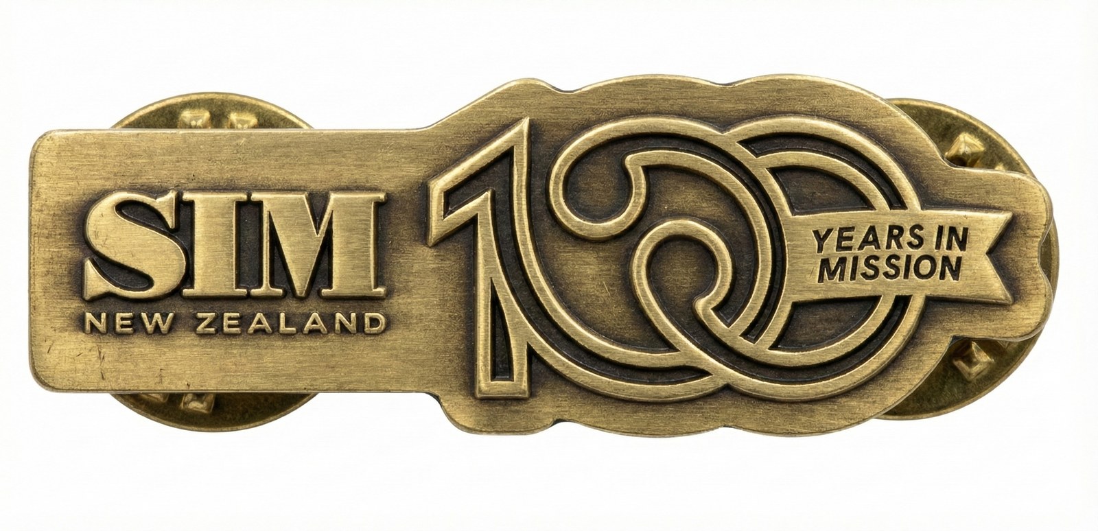
SIM New Zealand is celebrating 100 years. Through the celebration, the centenary mark sits beside our logo on the website, emails, presentations, Together magazine and merchandise.
The mark

A one and two linked zeros drawn in a continuous curling line, with a ribbon that reads Years in Mission. Brushed gold is the primary version.
It celebrates our history and never replaces the logo: use it beside the logo, or on the same page or screen. Keep the numbers and ribbon together and use only the versions below. Never redraw, stretch, rotate or add effects.
Like the koru forms in our symbol, its curling line is not cultural appropriation. Careful consideration was taken not to align it with any established, culturally tapu shapes or forms.
Colour versions
Gold comes first. Use a flat version only where gold can’t be reproduced, such as one-colour print, embroidery or engraving. Never set the gold on SIM red.
Gold
The primary mark, on white and light backgrounds, as in the website header.
Gold on Pounamu green
On dark panels and dark photographs, as on presentation slides.

SIM red
On white and light backgrounds.

Pounamu green
On white, Sand and light backgrounds.

White on Pounamu green
For dark panels and dark photographs.
White on SIM red
On red panels and merchandise.

Black
For one-colour printing, engraving and embossing.
White on black
For one-colour printing on dark stock.
With the logo
The mark sits to the right of the logo, centred on it, with no rule between them. Use the lockup files rather than placing the two by eye, and keep the logo’s clear space, the height of the symbol, around the whole lockup.

The gold mark beside the full-colour logo, as in the website header and email template.

The Pounamu green mark beside the full-colour logo, where gold can’t be reproduced.

All white, on Pounamu green, SIM red and dark photographs.
Construction and clear space
Like the logo, the mark was carefully constructed on circles and guides.
Construction
Both zeros are drawn on circles of the same size, centred on one line, and the curling line is outlined at one weight throughout. The film draws it in Pounamu green, the flat version for Sand.
Clear space
On its own, keep clear space on every side equal to the height of the ribbon, shown as x.
Minimum size
30 mm wide in print, 160 px wide on screen. Where space is tighter, leave the mark out, as the website does on tablets and phones.
In use
100 year mark downloads
All of these are also in the brand pack, in the 09 100 Years in Mission folder.
Typography
Two typefaces cover everything. Literata gives headings warmth and authority, Hanken Grotesk keeps everything else clear.
Typefaces
The primary typeface. Literata sets page titles, hero headings, lead-ins and section headings such as FAQs. Set it to a small optical size, so the type is more evenly weighted than the large optical size renders it. This matters most when pairing it with Hanken Grotesk in headings, as in Together magazine.
Aa
ABCDEFGHIJKLMNOPQRSTUVWXYZ
abcdefghijklmnopqrstuvwxyz
0123456789
- Regular
- Italic
- SemiBold
The secondary typeface. Hanken Grotesk sets body text, buttons, navigation, card titles and statements. Body text is 16 px on a 1.4 line height, and 18 px on 1.7 in stories. Ragged right, never justified. Sentence case throughout, including buttons; the only uppercase style is the eyebrow, Hanken Grotesk Bold with 0.25 em tracking.
Aa
ABCDEFGHIJKLMNOPQRSTUVWXYZ
abcdefghijklmnopqrstuvwxyz
0123456789
- Regular
- Bold
- Black
Type scale
Sizes as sim.org.nz sets them at its widest layout. Every size is fluid between 360 px and 1600 px, so use the website tokens rather than fixed pixels.
| Style | Typeface | Size / line | Token |
|---|---|---|---|
| Page title | Literata Regular | 80 / 72 px | --h1 |
| Hero title | Literata Regular | 72 / 75.6 px | --lead-in |
| Story title | Literata Regular | 68 / 61.2 px | --h1-blog |
| Section heading | Literata Italic | 47.2 / 42.5 px | --h2 |
| Statement | Hanken Grotesk Black | 27.2 / 35.4 px | --h3 |
| Card title | Hanken Grotesk Regular | 27.2 / 32.6 px | --h3 |
| Intro | Hanken Grotesk Regular | 24 / 31.2 px | --h1-sub |
| Body, stories | Hanken Grotesk Regular | 18.1 / 30.7 px | --body-lrg |
| Body | Hanken Grotesk Regular | 16 / 22.4 px | --body |
| Eyebrow | Hanken Grotesk Bold, caps | 16 / 20.8 px, 4 px tracking | .title-tag |
| Button | Hanken Grotesk Bold | 18.2 / 21 px | --button-reg |
Colours
Red is the signal, Pounamu green carries headings and dark panels and the accent greens and Sands are the surfaces everything sits on.
Primary colours
Use these for the logo, print, signage and anything that carries the brand.
SIM red
- PANTONE
- 485 C
- CMYK
- 9, 96, 100, 1
- RGB
- 218, 43, 31
- HEX
- #DA2B1F
Pounamu green
- PANTONE
- 627 C
- CMYK
- 84, 55, 69, 62
- RGB
- 20, 51, 45
- HEX
- #14332D
Charcoal
- PANTONE
- Black 7 C †
- CMYK
- 0, 0, 0, 96*
- RGB
- 54, 54, 54
- HEX
- #363636
Accent green
- PANTONE
- 2295 C
- CMYK
- 14, 0, 53, 0
- RGB
- 224, 236, 146
- HEX
- #E0EC92
Colour palette for web
The website uses tints of accent green and two Sands for surfaces, cards and forms.
Accent green
Sand
For print: accent green 75, 50 and 25 are PANTONE 2295 C at 80%, 60% and 30% †. Sand 50 and 25 are PANTONE Warm Gray 1 C at 60% and 20% †. Pantone and CMYK for SIM red, Pounamu green and accent green are from the original SIM NZ brand guide. † Closest Coated equivalents: check them against a swatch book and a printed proof. * Closest-match CMYK from HEX; Charcoal is black only so small type prints sharp.
Using colour
Charcoal (#363636) for body copy and Pounamu green (#14332D) for headings on white, Sand and the accent green tints. On Pounamu green panels set text in white, with accent green for links, button labels and eyebrows. On SIM red panels set text in white.
SIM red is the signal colour. It carries the logo, the Donate and Serve with us buttons and bold panels with white text. Red is not a body text colour: keep it to short labels and links on white, and never set it on Pounamu green. As a shorthand, it is the closest match to Coca Cola red when a Pantone book is not handy.
Charcoal or Pounamu green on white, Sand or the accent green tints pass the accessibility standard at any size. So do white or accent green on Pounamu green, and white on red. Red on Sand, and accent green or Sand on red, only work for large headings. Red on Pounamu green never passes, and nor does accent green on light colours. On screen, anything clickable shows a clear outline when reached by keyboard.
Imagery
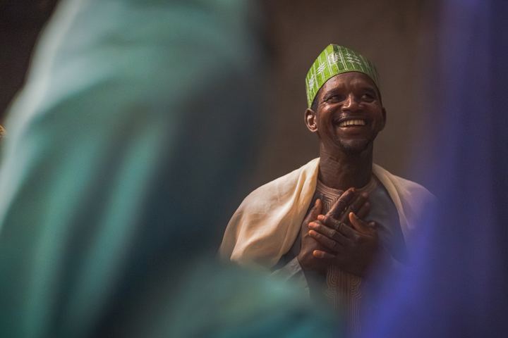
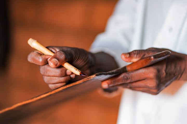
Real people, real moments and one brushstroke device that ties it all together.
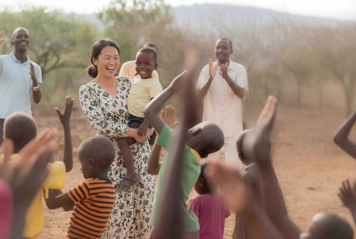
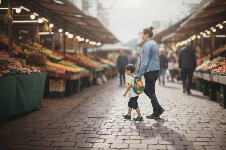
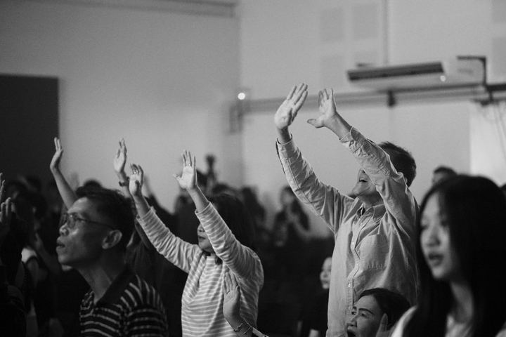
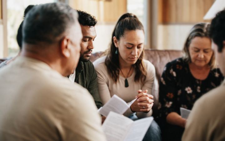
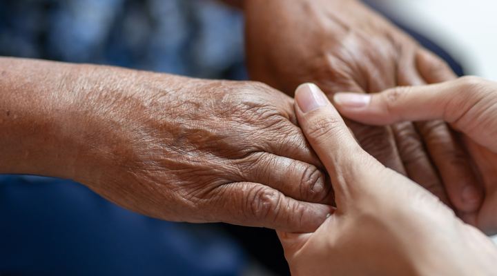
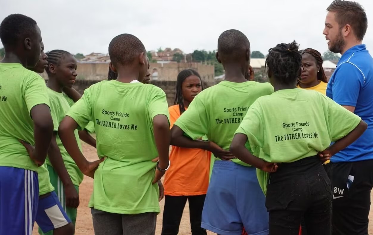
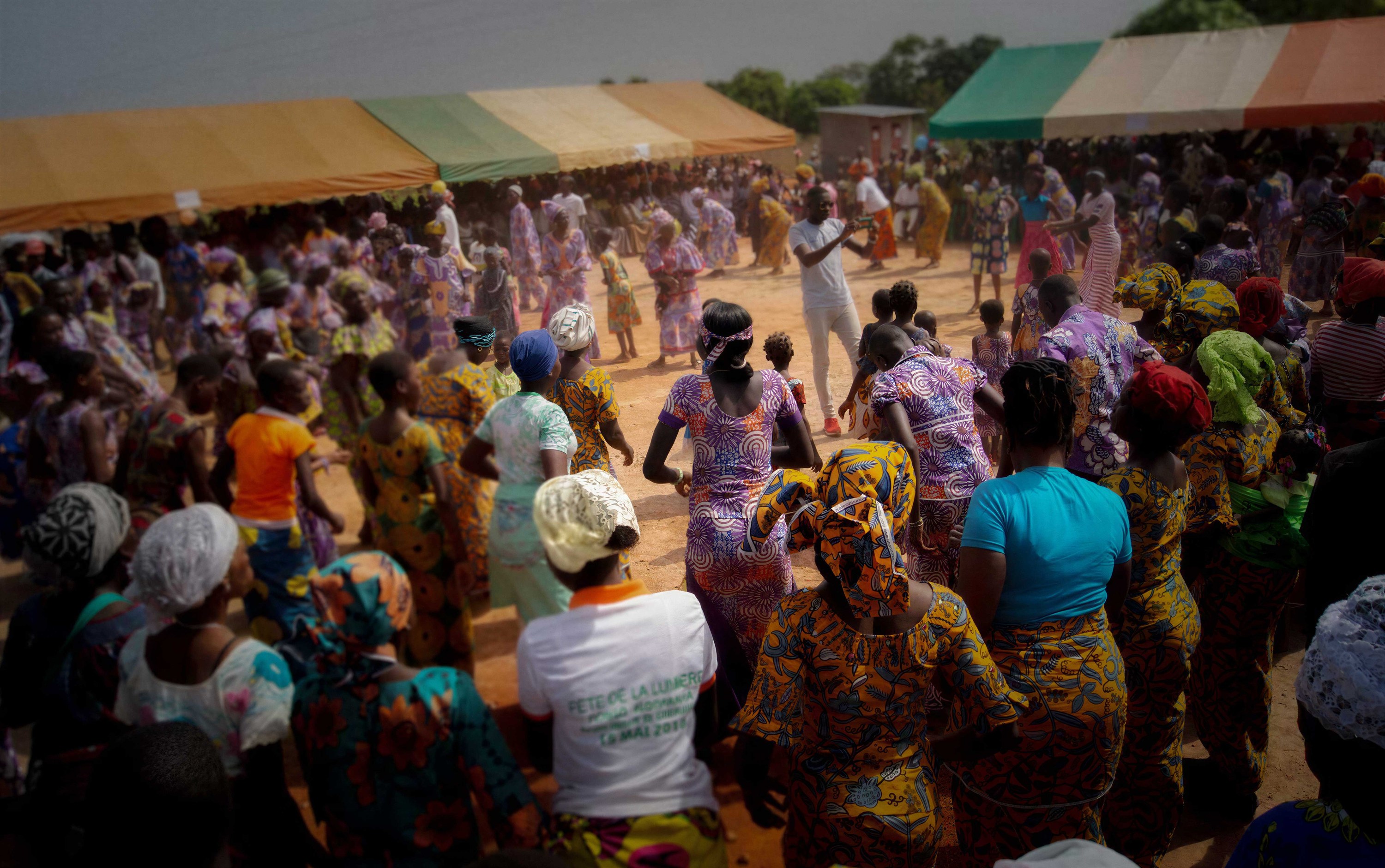
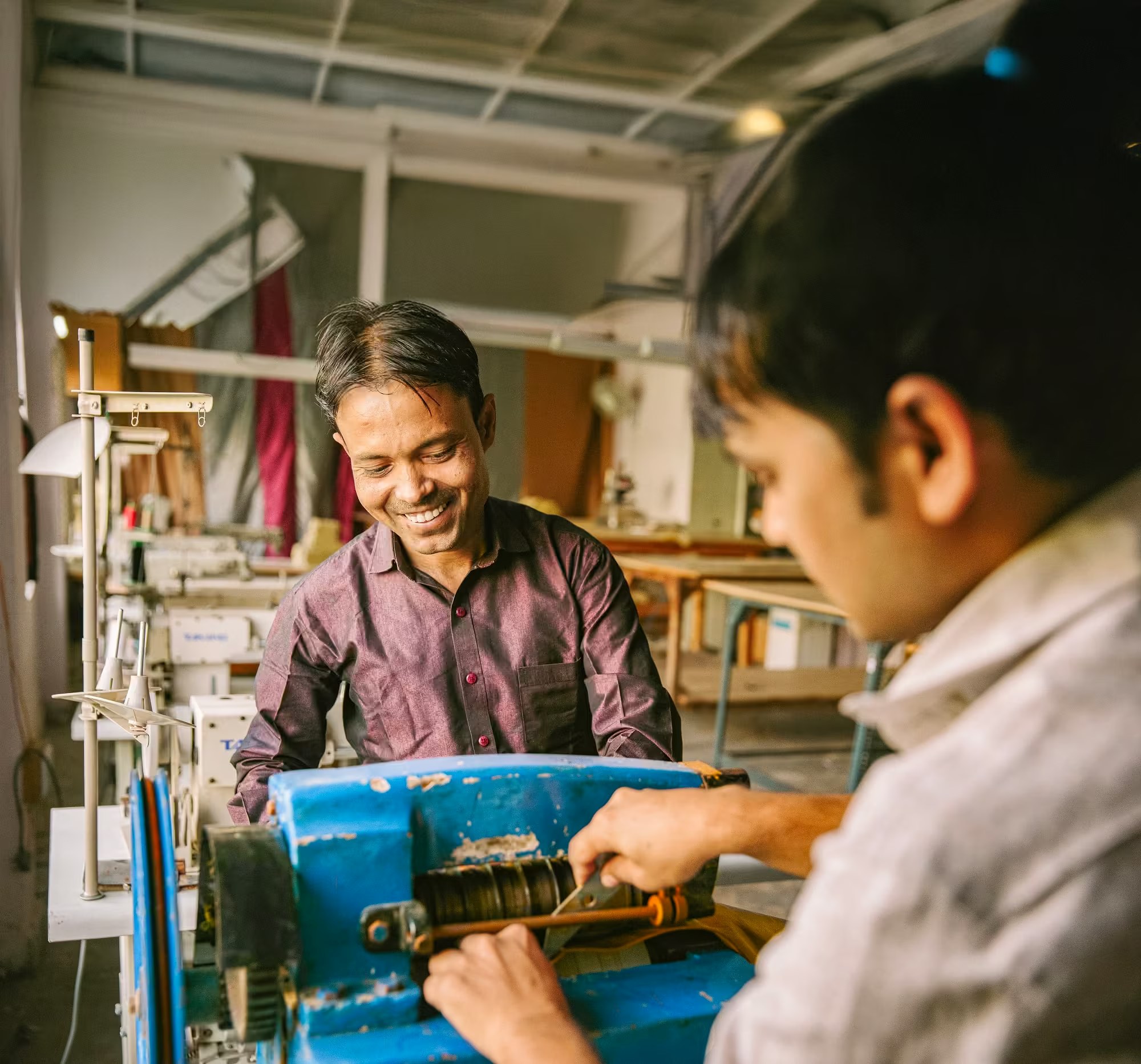
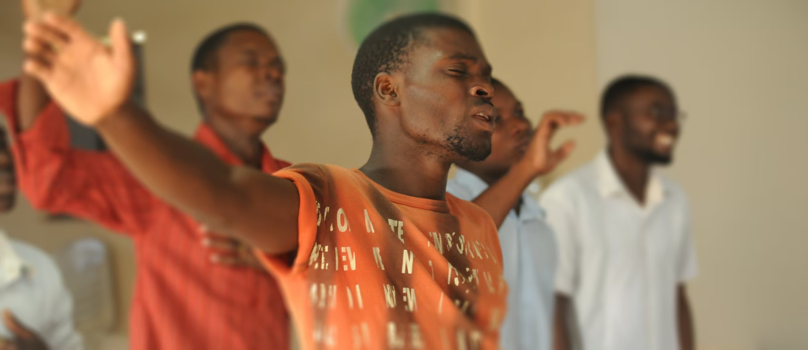
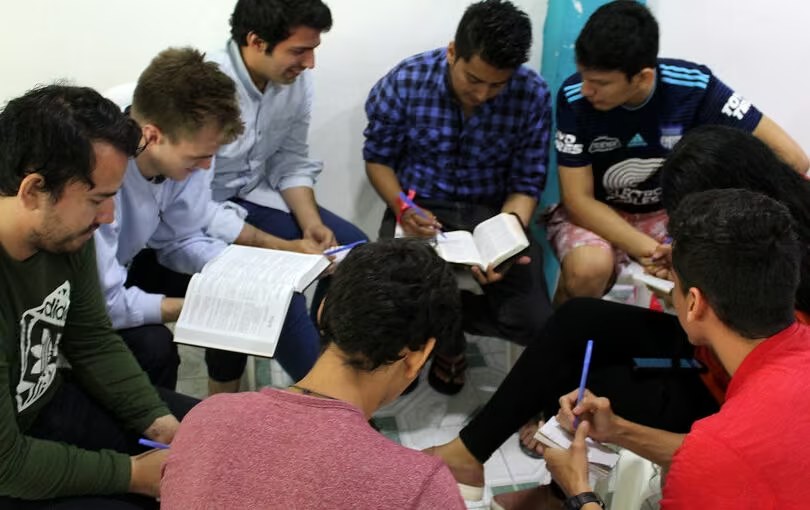
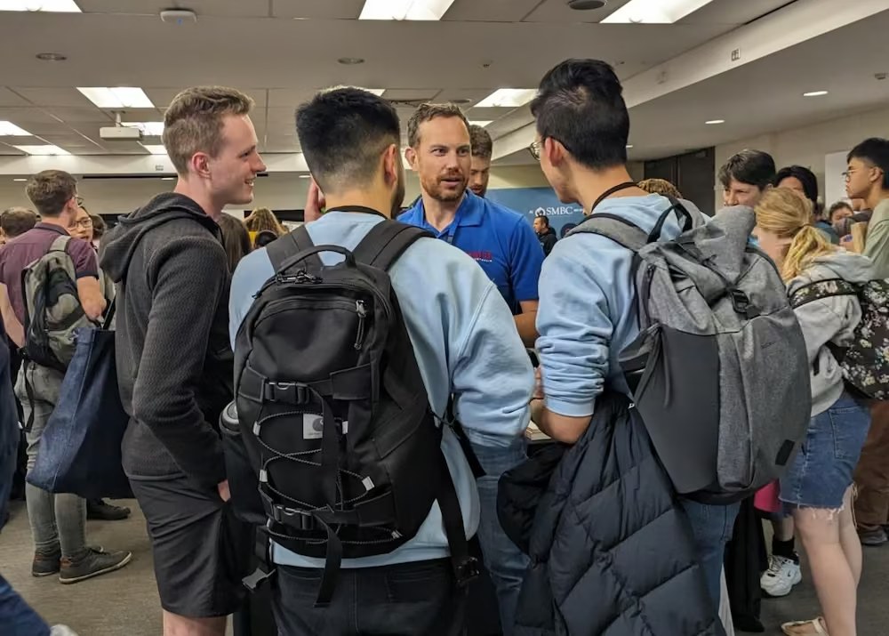
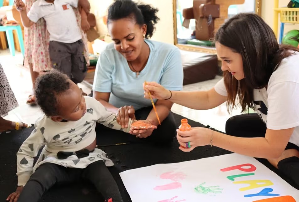
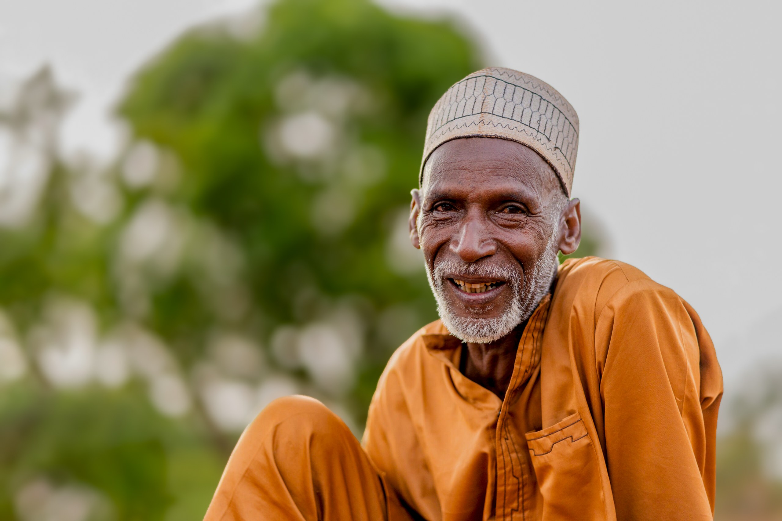
- Show mission partners at work with the people they serve, not posed in front of a building.
- Where security matters, use a silhouette or a shot from behind.
- Always get permission, and follow the child safety and image policy.
The brushstroke square from the symbol is a window. Use it to frame a photo at the same slight angle as the logo, so the layout feels like it is moving forward. Its brush edge is what ties photography, illustration and graphics together.
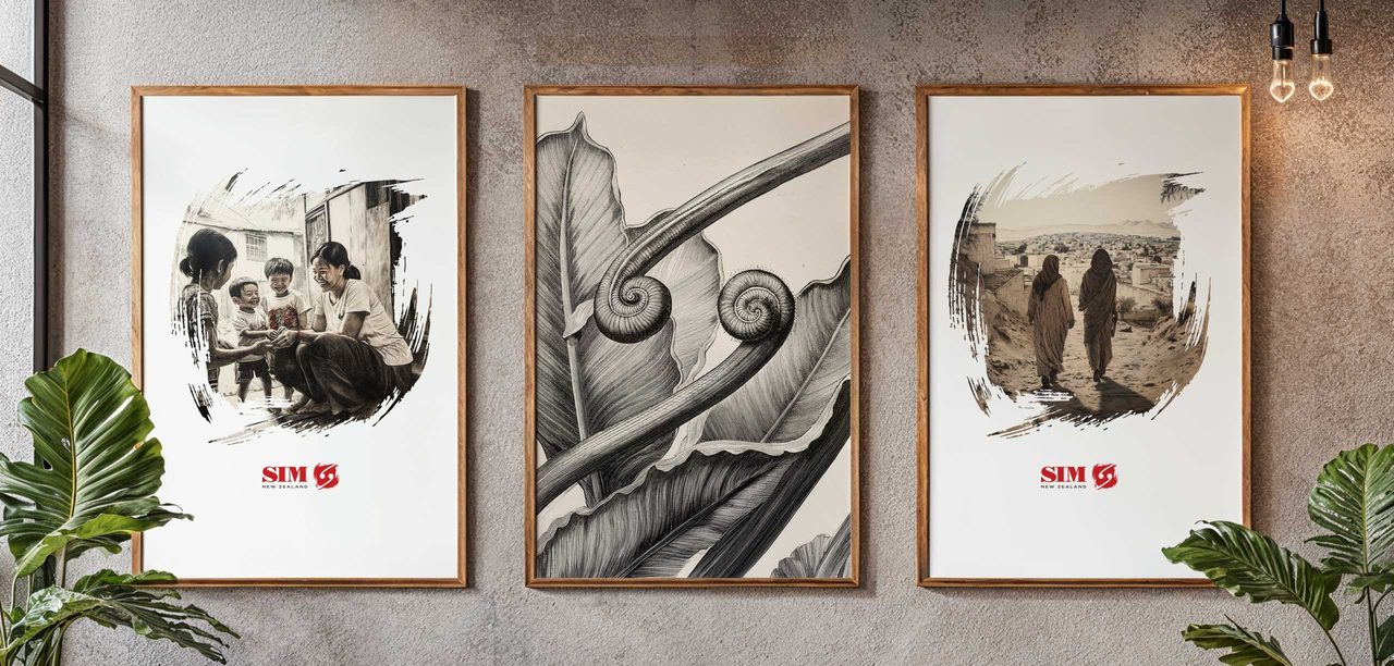
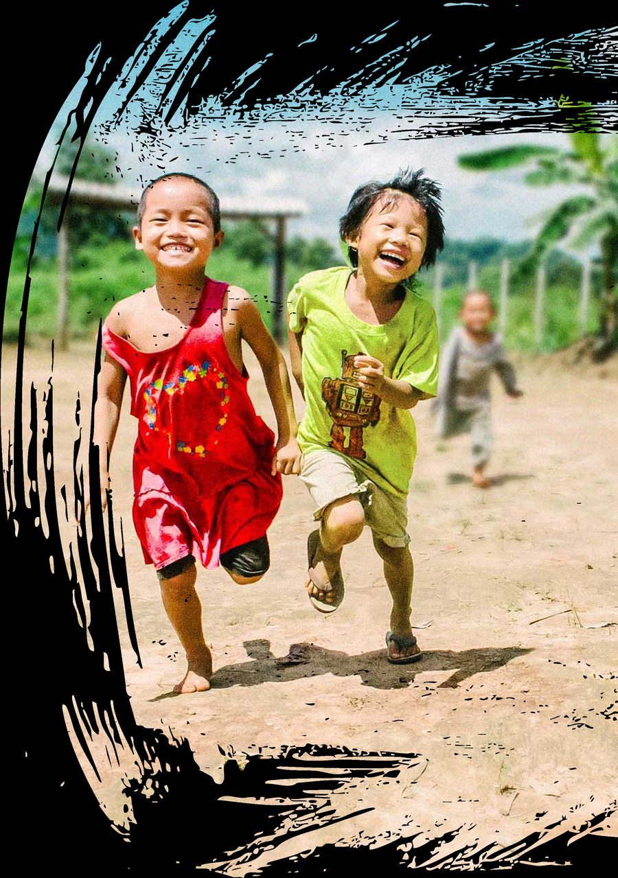
- Clean, with generous white space and one strong image per page or screen.
- Align to a grid and keep text blocks straight, with diagonals as accents only.
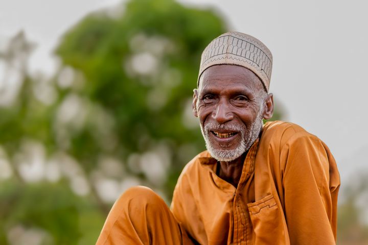
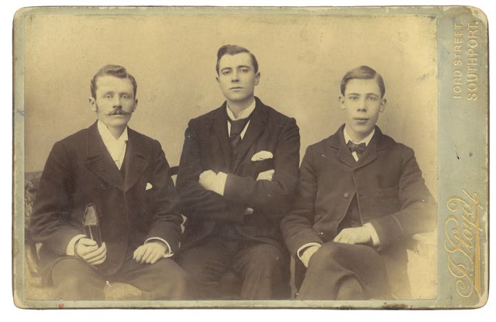
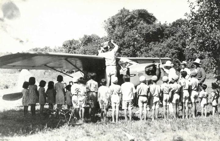
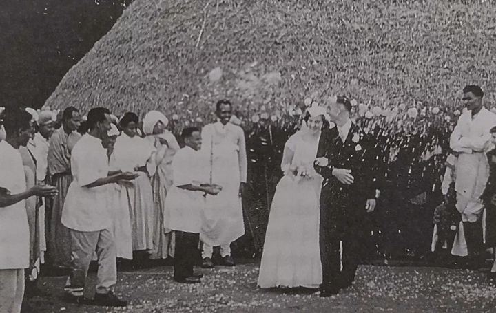
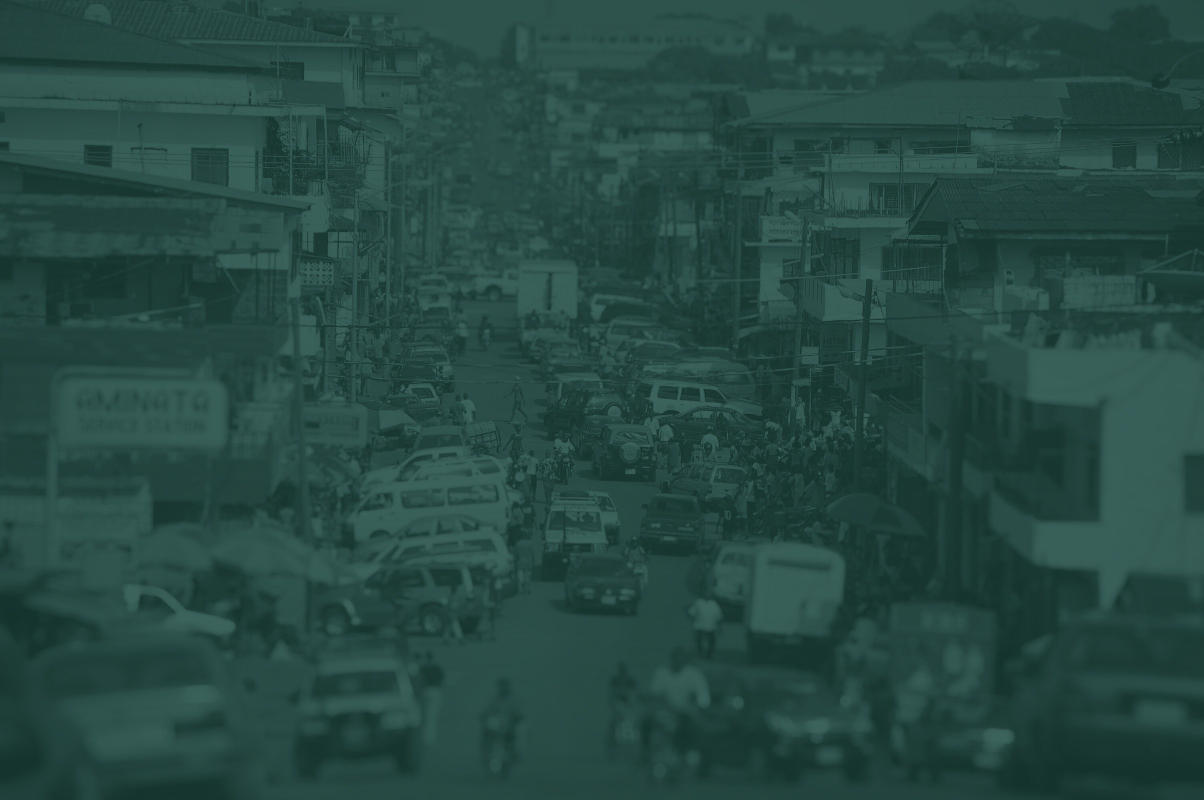
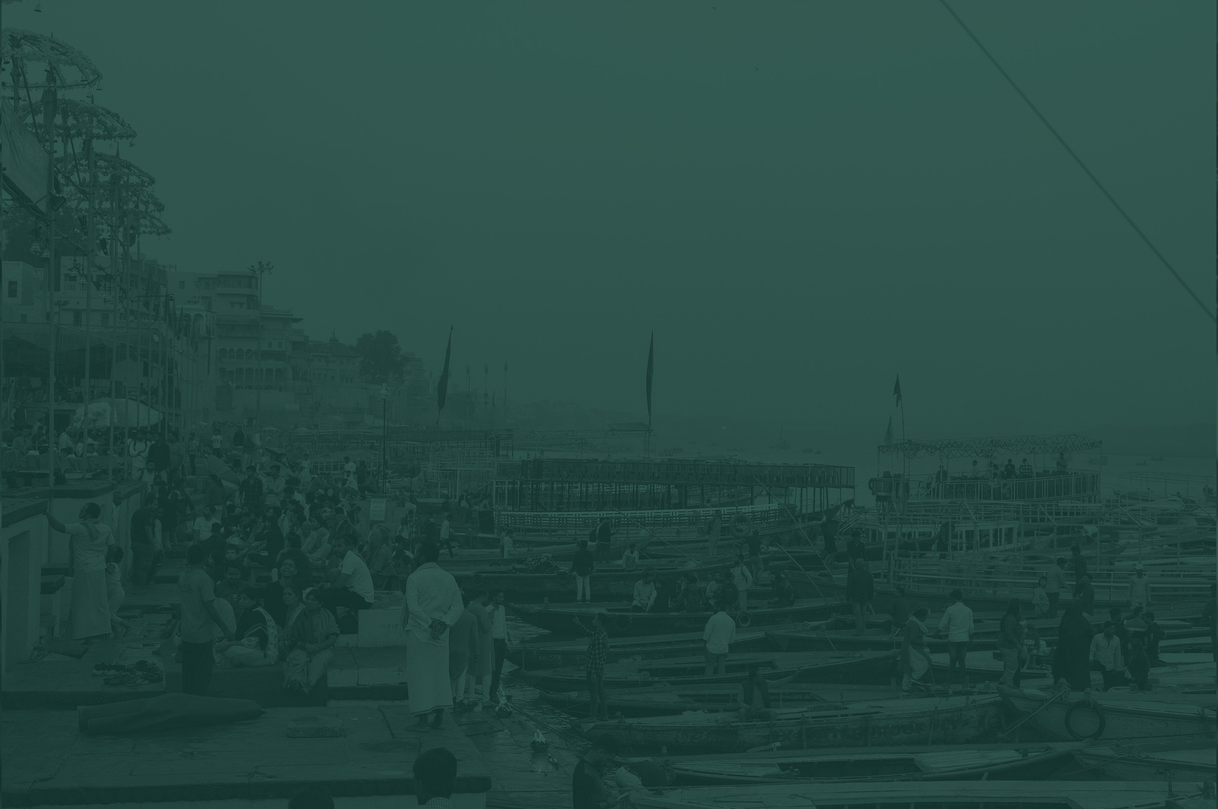
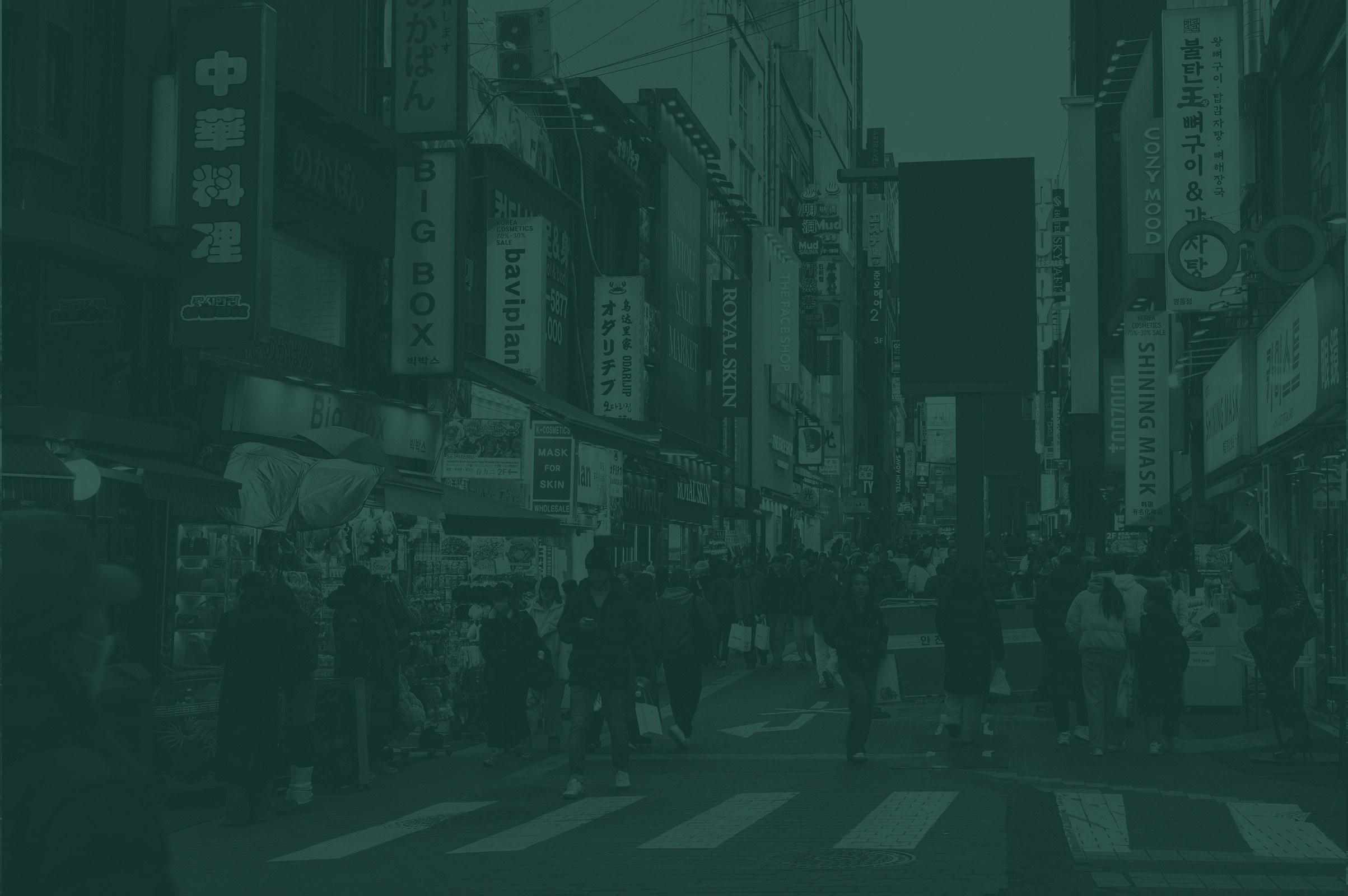
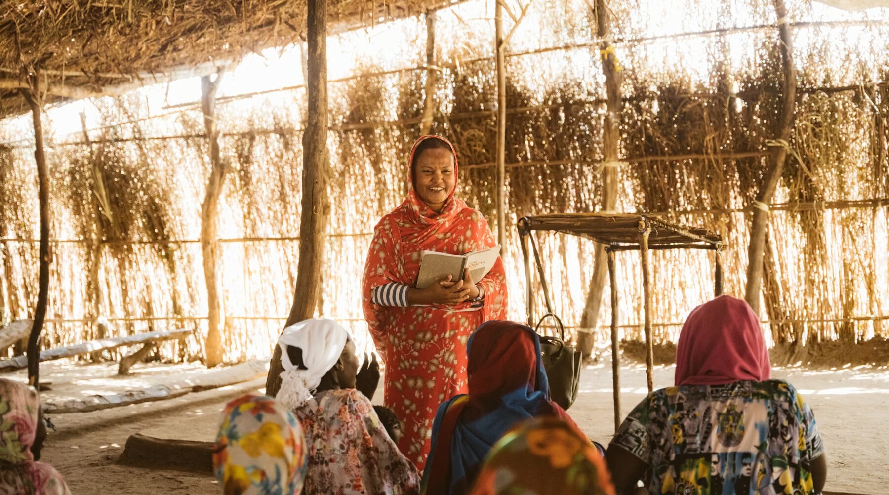
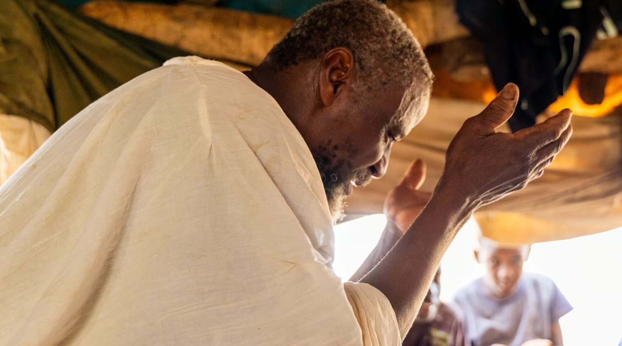
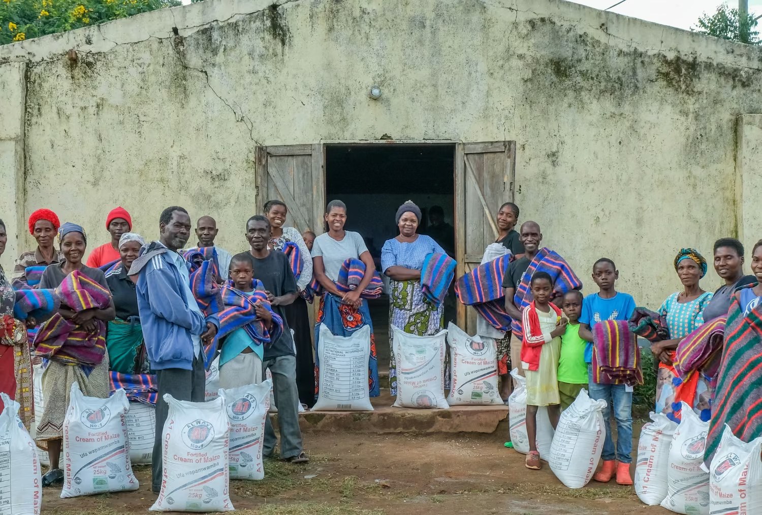
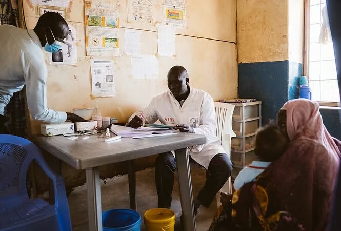
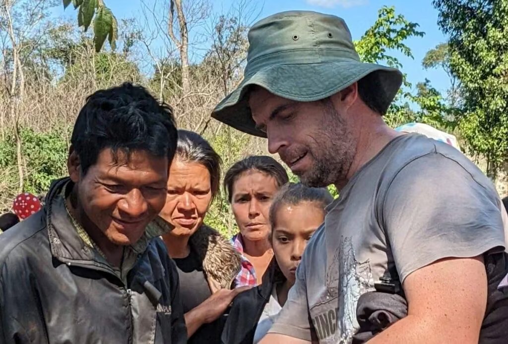
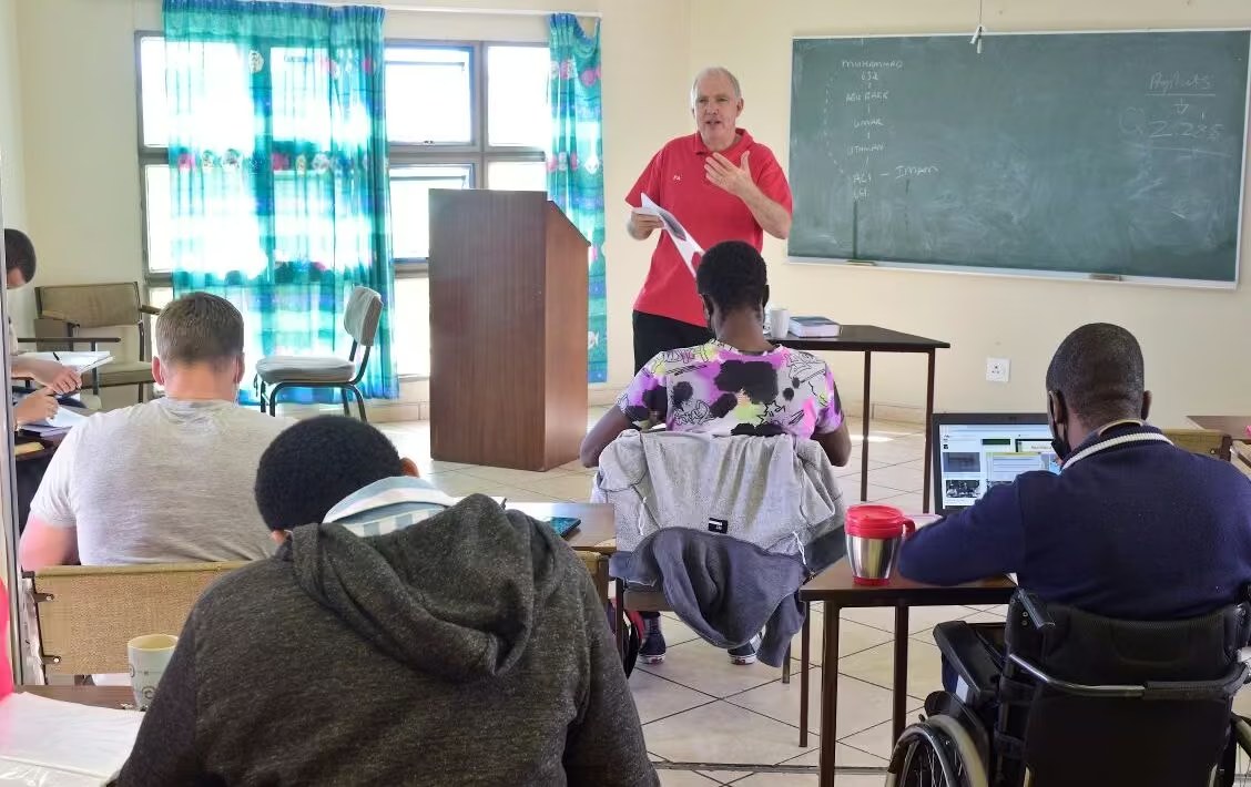
Image library
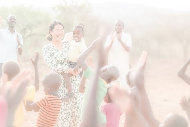
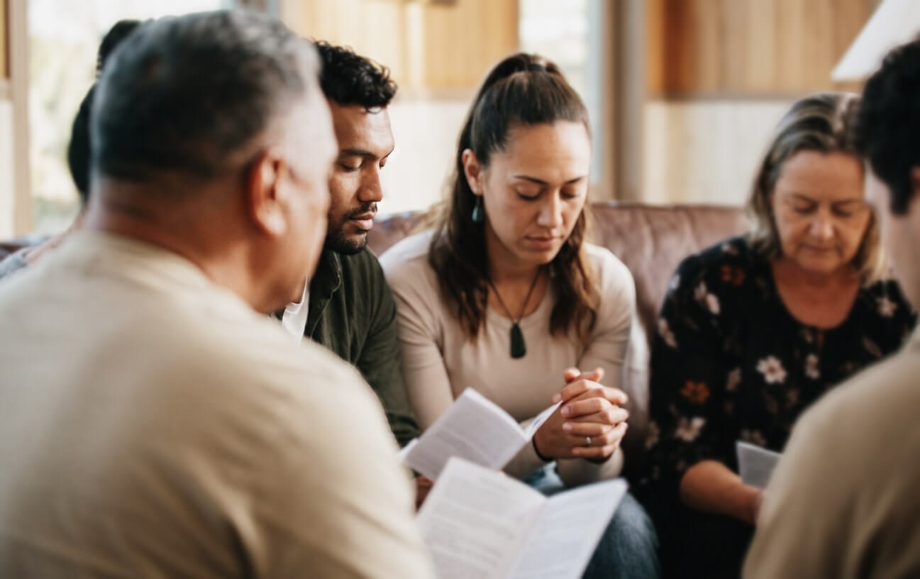
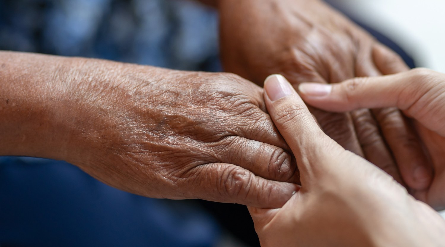
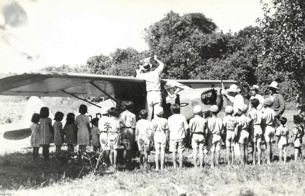
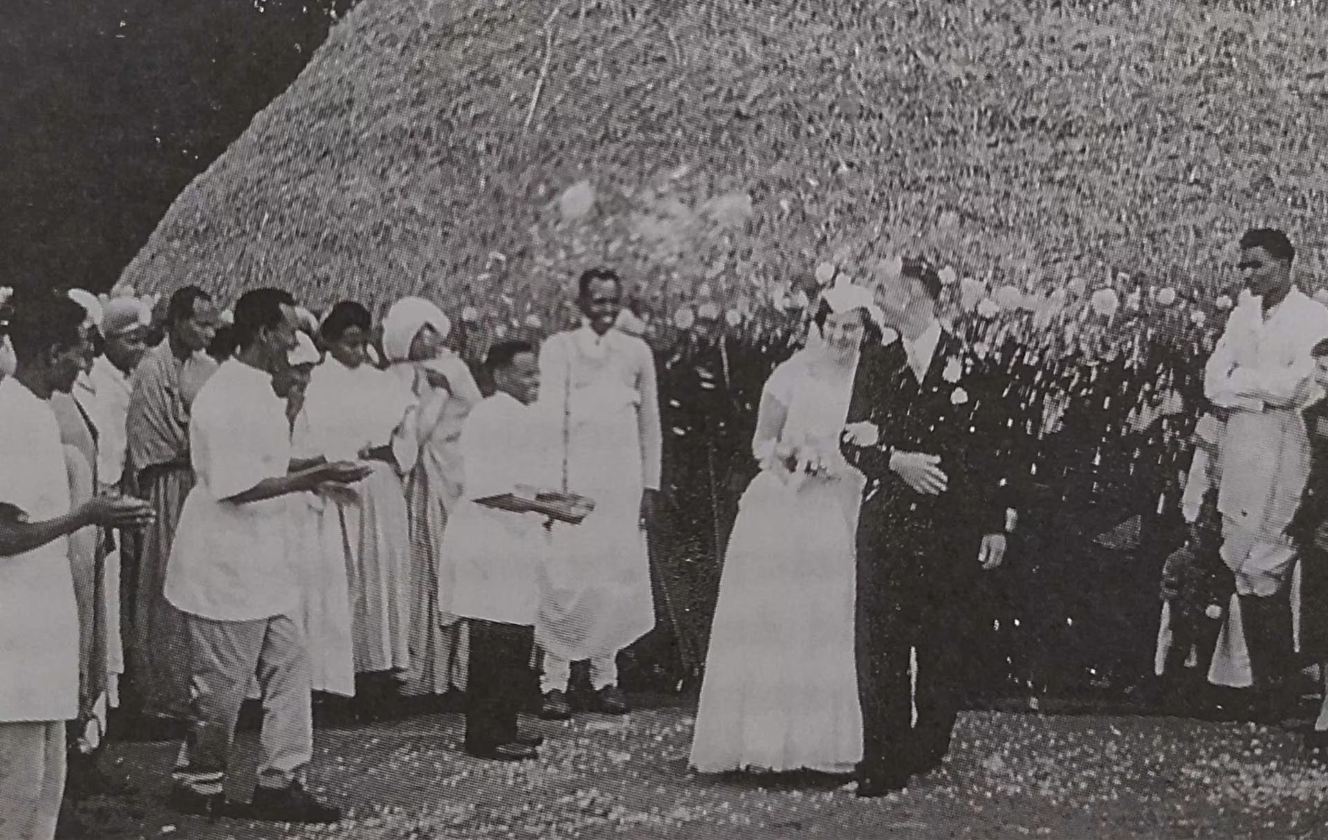
For SIM New Zealand's own work, and all in the brand pack. Use images carefully: choose one that fits what you are saying, don't repeat the same photo across pieces and never suggest a person or place is part of a story it isn't.
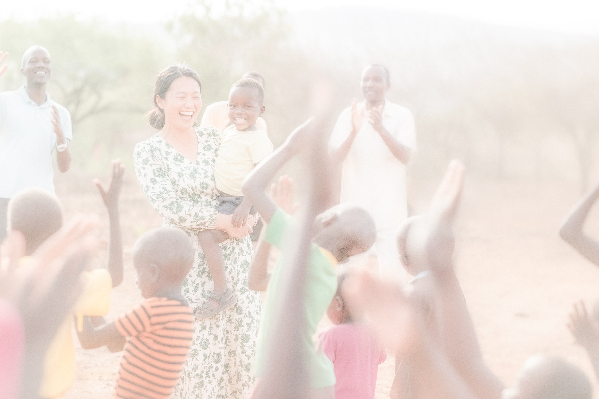
Photographs toned in Pounamu green for text to sit over, as on our presentation slides, with full-colour versions where we have them.
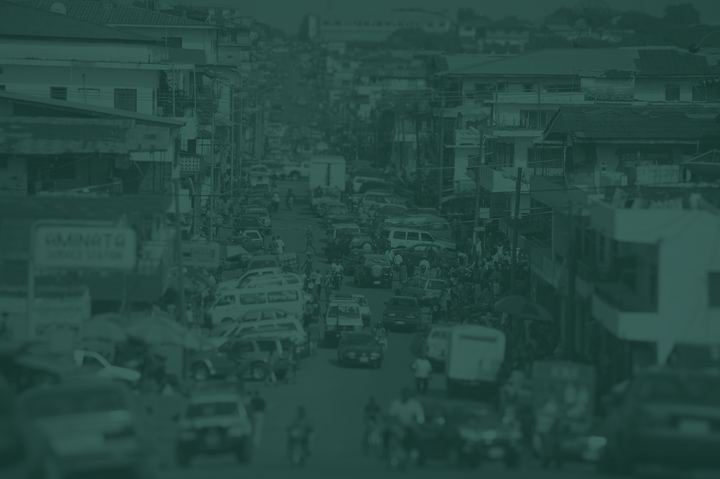

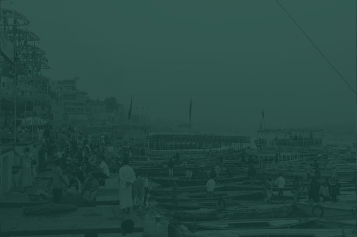
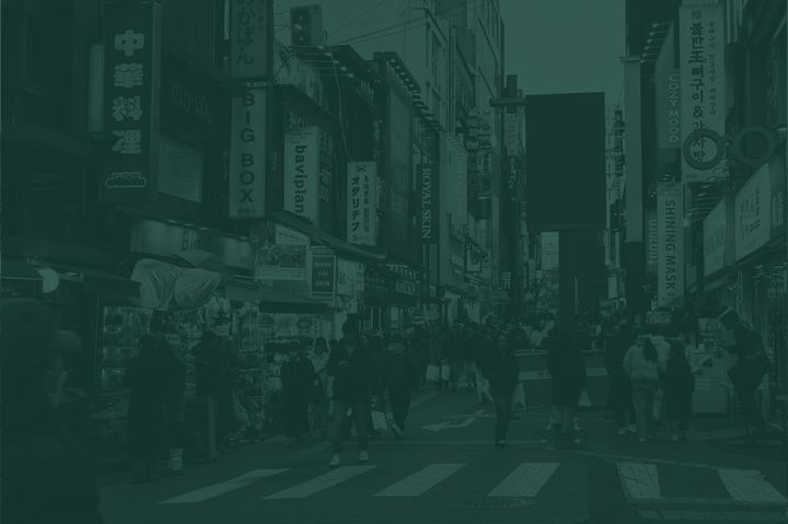
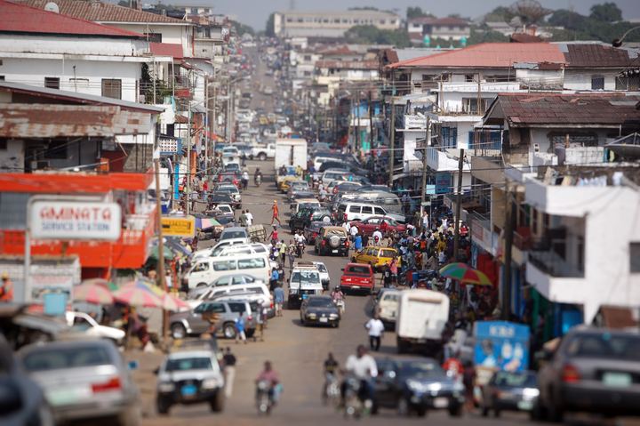
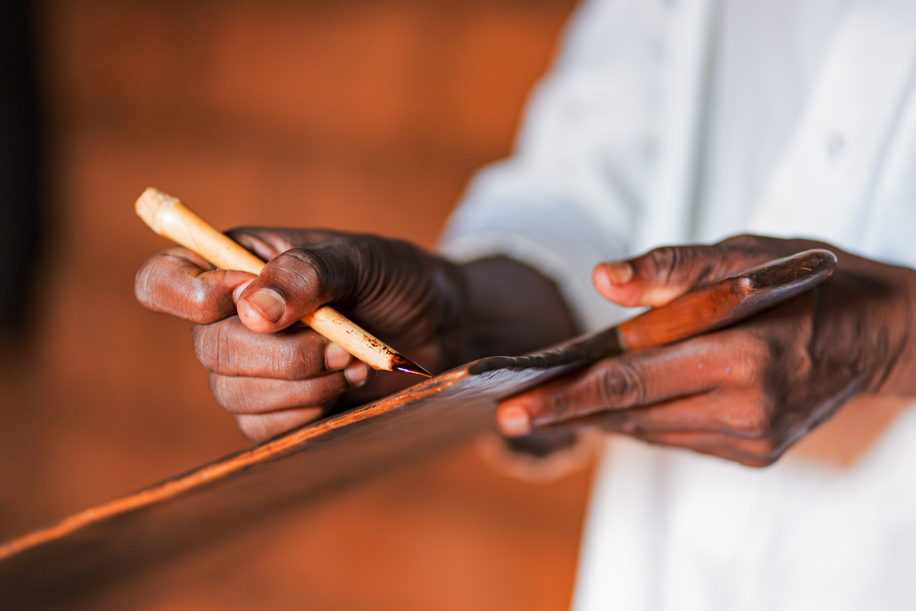
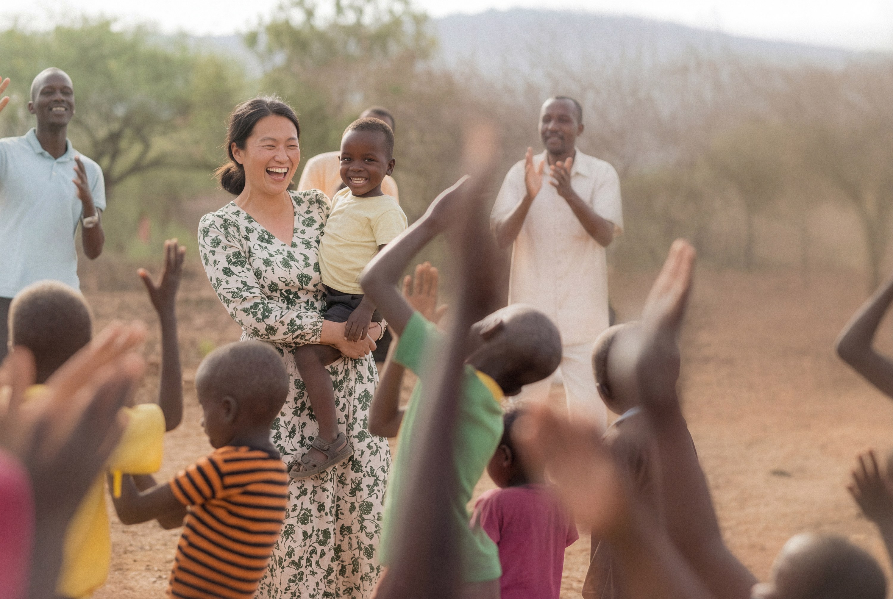
SIM ministry around the world, as used on sim.org.nz.

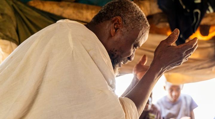
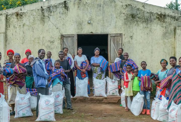
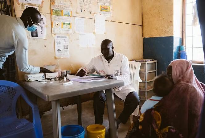
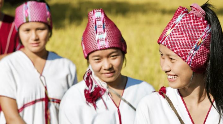
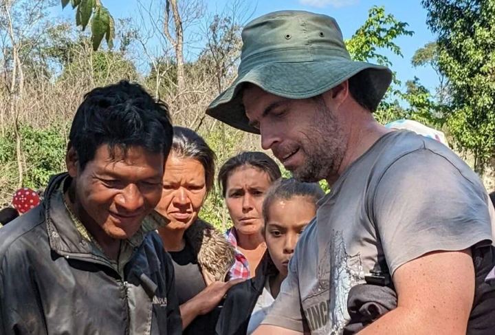
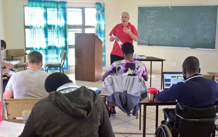
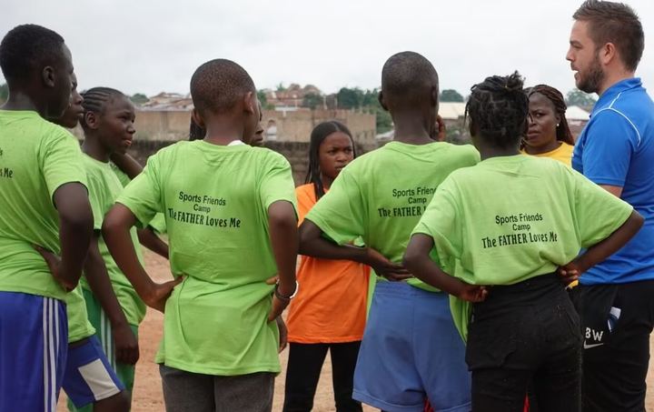
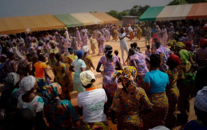
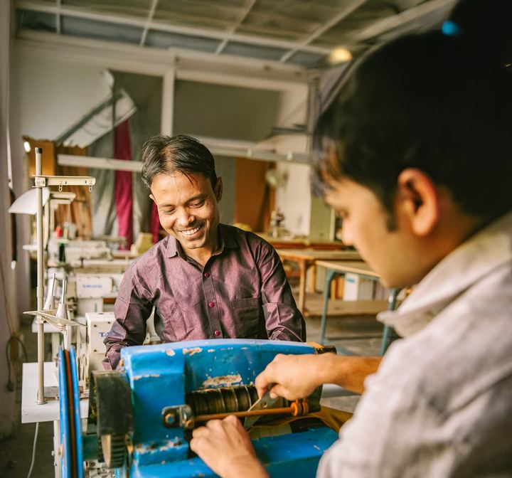
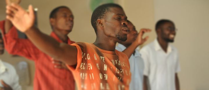
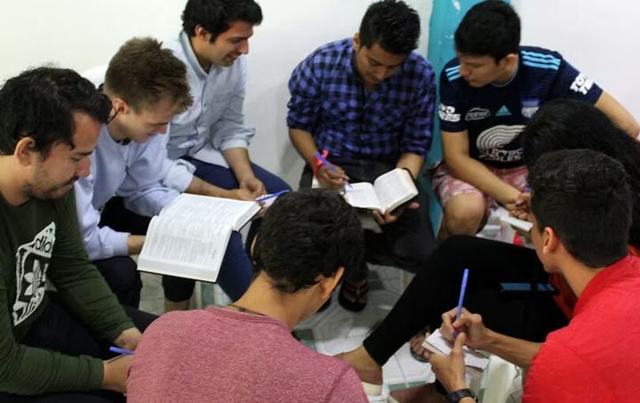
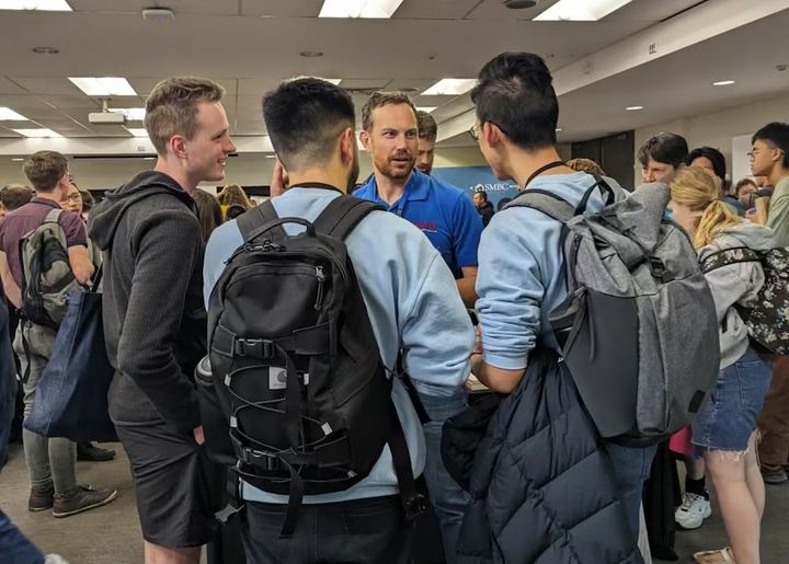
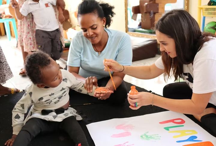
Some of these are licensed stock photographs: use them only in SIM New Zealand's own materials and don't pass the files on.





















Applications
How the brand carries across print, screens, events and partnerships.

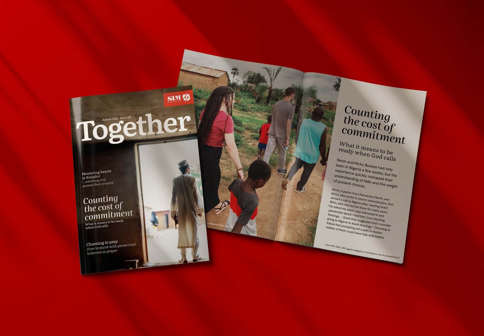
- Covers lead with the square frame or one strong photograph.
- Logo and contact details on the back cover.
- Business cards carry the logo on one side, and the name, role and contact details on the other.
- Letterhead is A4, with the logo at the top and contact details small at the foot.
- 300 dpi images, vector logos, CMYK or Pantone values and a proof for anything important.
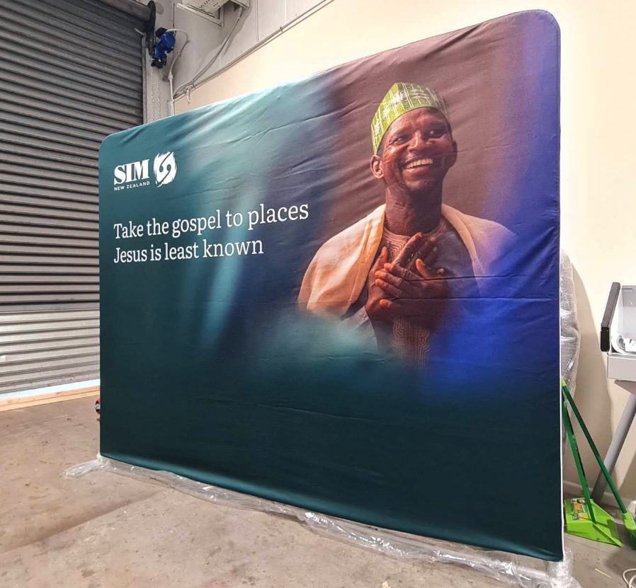
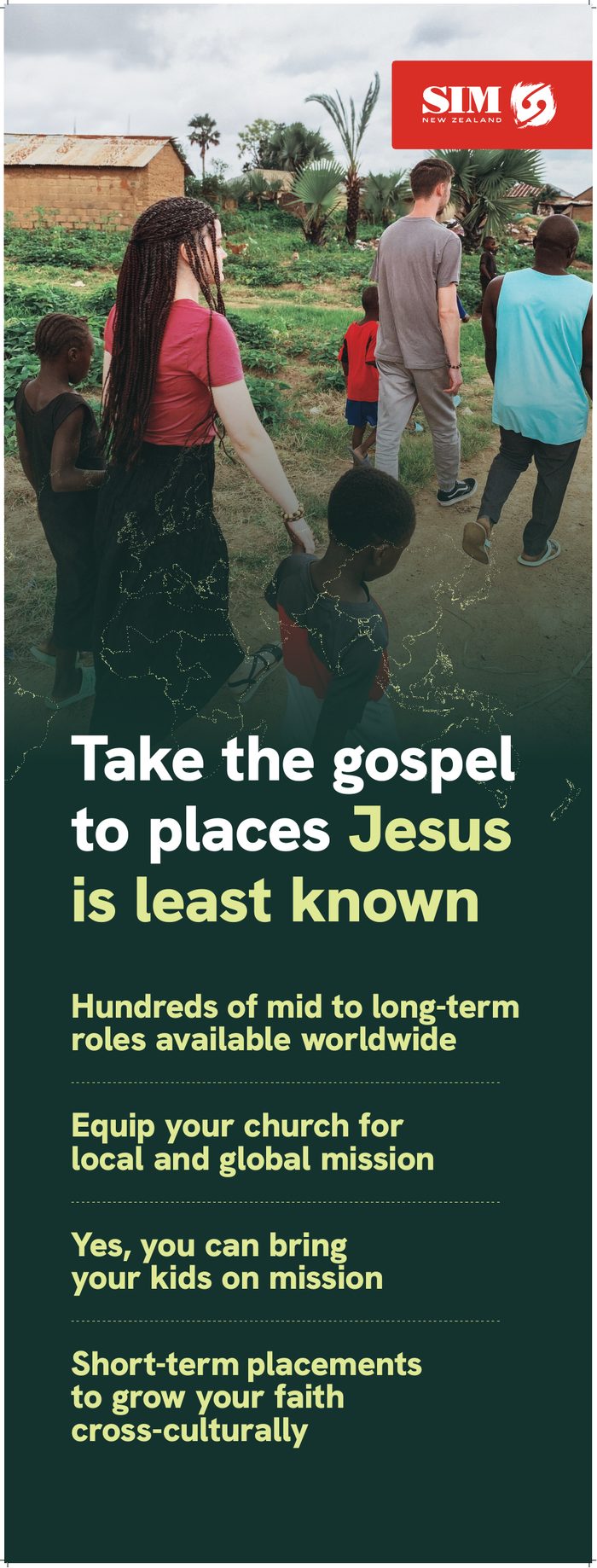
- Vector logos only for large format, so nothing pixelates.
- One message, set large, with the logo present but not dominant and its clear space respected.
- White logo on dark or red panels, full colour on white.
- Check displays from 10 metres away.
- Replace anything faded or worn.
- At a booth, the tablecloth, banners and name badges carry the logo.
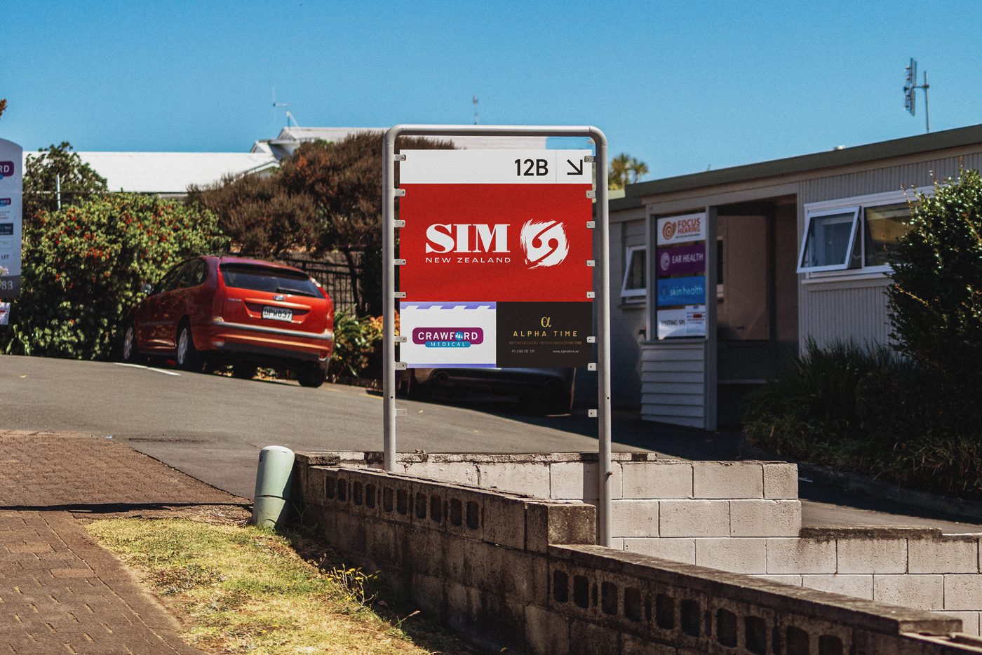
- Event and directional signs use a white background, our typefaces and arrows in SIM red or Pounamu green.
- Themed events stay on brand: bring the theme into our design, not the other way round.
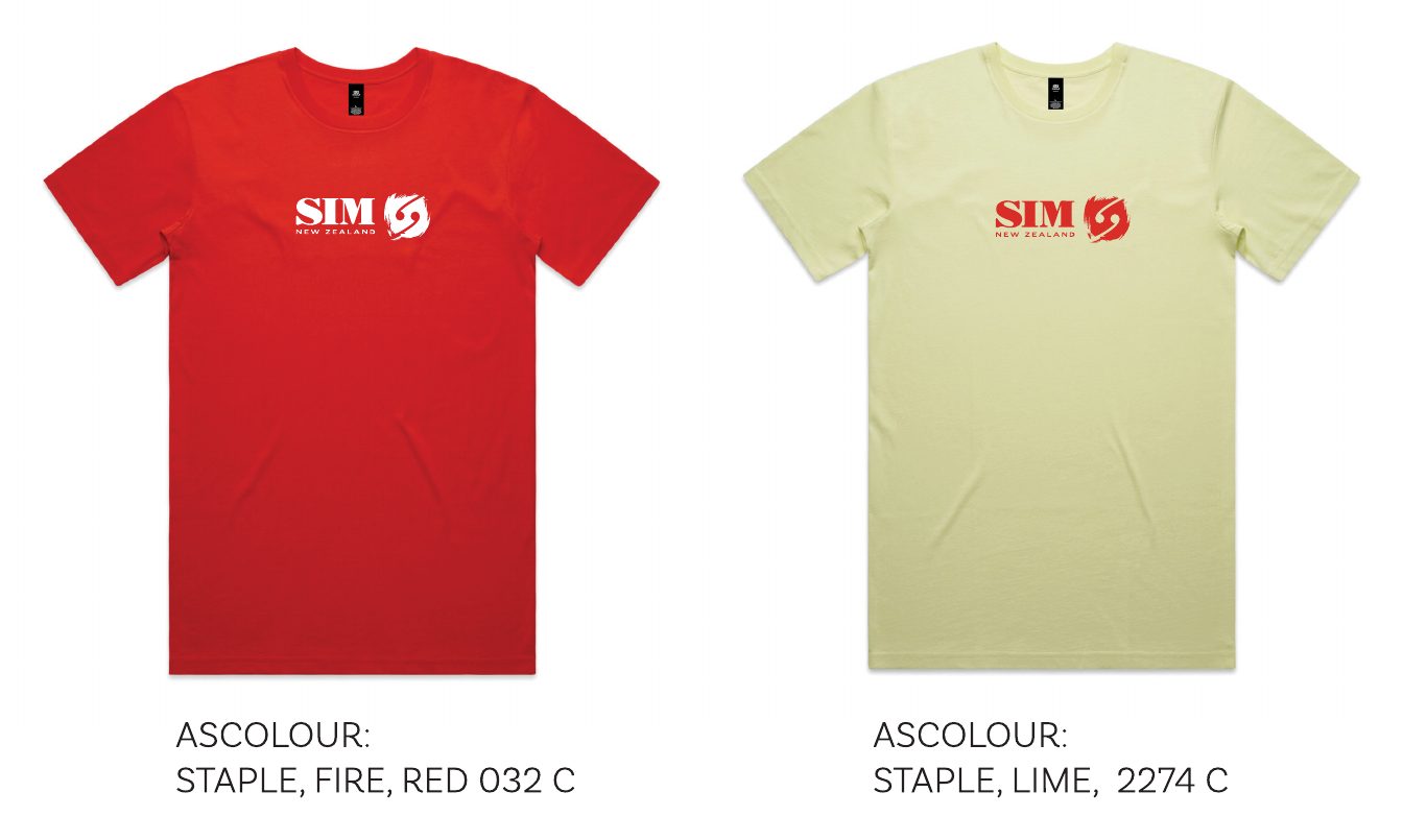
- Usually just the logo, one per item.
- Choose quality items that last.
- White logo on red or dark fabric, full colour on light fabric.
- On polos and jackets the logo sits on the left chest; team and event shirts can carry it centred on the front.
- For embroidery, match thread to the palette and approve a stitch sample, as fine brushstroke detail may need simplifying.
- Ask for a proof or sample before ordering in quantity.
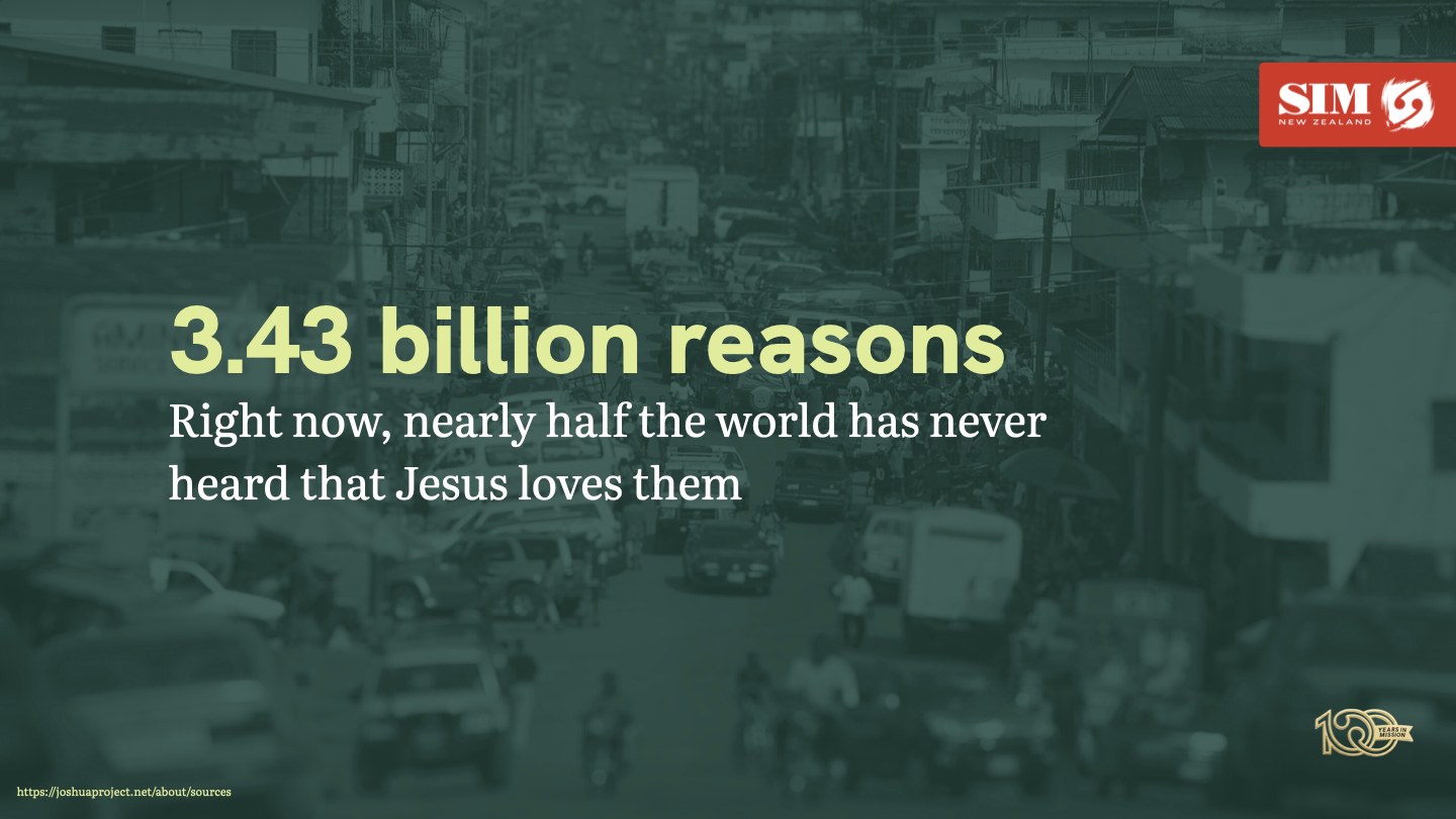
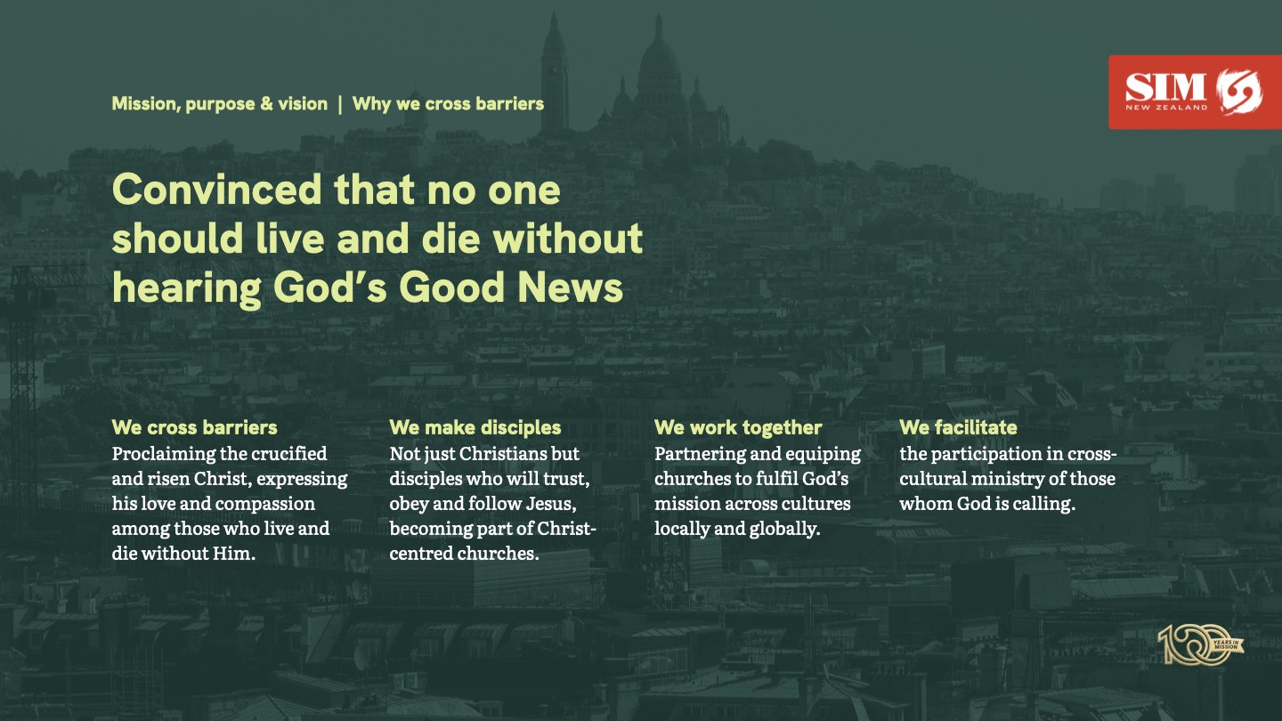
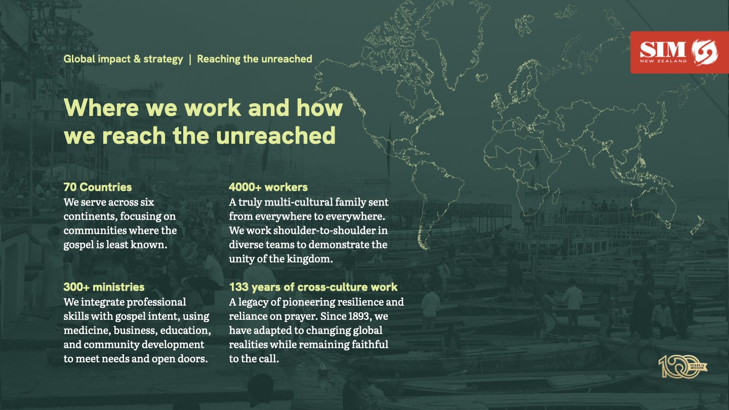
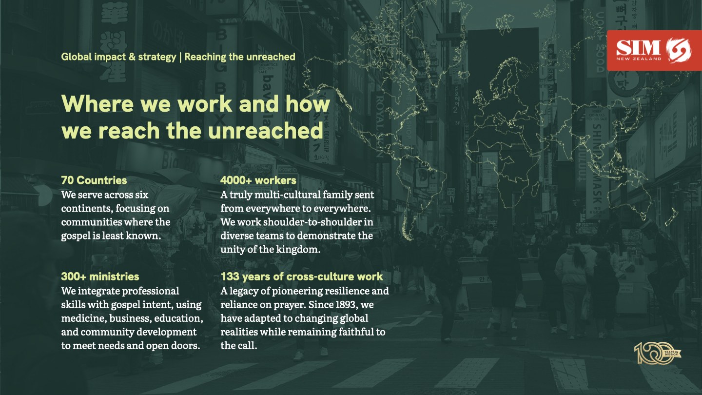
Four slides: title, four points, numbers and a closing contact slide. Install Literata and Hanken Grotesk from Google Fonts first.
Presentations
- 16:9 slides on photographs toned in Pounamu green, so white and accent green text stays readable.
- The white logo on a SIM red tab at top right, and the gold 100 year mark at bottom right.
- Headlines in Hanken Grotesk Heavy in accent green, with supporting text in Literata.
- One idea per slide: a headline and up to four short points.
- Close on the contact slide, so people know their next step.
Website and video
- sim.org.nz is the reference for spacing, type and colour.
- Video opens and closes on a title card with the logo and sim.org.nz.
- Downloadable resources get a branded cover and a file name that starts with SIMNZ, such as SIMNZ_PrayerGuide2026.pdf.
- Alt text on images, captions on video and a visible focus outline on anything clickable.
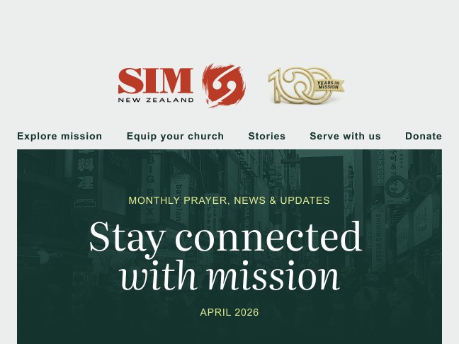
Our supporter emails are built in Mailchimp from the SIM New Zealand email template. Every email starts from that template, so each send looks and reads the same.

- Header
- The logo with the gold 100 year mark, and the website menu.
- Welcome
- A Pounamu green panel with the issue label, Stay connected with mission, the month and a short intro from the editor.
- Stories
- A photo, a label such as Project spotlight, a Literata headline, two or three sentences and a Keep reading button.
- Invitation
- One panel for the current call to action, such as short-term mission trips.
- SIMply Prayer
- The monthly prayer guide sign-up.
- Together magazine
- The latest issue, with a button to read it online.
- Footer
- Phone, email and social links, the white logo and the unsubscribe and preferences links.
The template preview, the header lockup and backgrounds, the advert and prayer banners, the footer icons and logo, and example story photos.
Using the template
- Start every supporter email from the template in Mailchimp, never from a blank email.
- Change the words and photos, not the layout, colours or fonts.
- Keep the header, welcome panel and footer as they are, and build the middle from story, invitation, prayer and magazine blocks.
- Full-width photos are 1200 px wide, so they stay sharp on high-resolution screens.
- Give every image alt text, and never put important words only in an image.
- Write a short subject line and set the preview text.
- Keep the unsubscribe link in the footer: Mailchimp requires it, and so does New Zealand spam law for commercial emails.
- Send yourself a test and check it on your phone before it goes out.
Sources. Image sizes: Mailchimp, image recommendations for content blocks. Unsubscribe: Department of Internal Affairs, New Zealand spam law for businesses.
Six starting templates, one for each story we tell most. They are shown at about the size of a phone feed: if something is hard to read here, it is too small.

The need. One striking fact, text-led.
Caption
Right now, an estimated 3.43 billion people have never heard that God loves them.
That’s why we go: no one should live and die without hearing His good news. Find out how you could be part of it at sim.org.nz
Source: Joshua Project
#SIMNewZealand #WhyMission #LeastReached #GlobalMission #ByPrayer

The invitation. One photograph and one call to action.
Caption
Find your place in God’s story.
Teacher, nurse, builder or retiree, there’s a place for you in reaching people where Jesus is least known. You don’t have to go at it alone.
Talk to a mission coach: sim.org.nz/mission-coach
#SIMNewZealand #FindYourPlace #ServeWithUs #MissionNZ #CrossCulturalMission

The reassurance. A carousel cover that answers a real question.
Caption
Am I ready to go?
Readiness is less about perfection and more about willingness. If you’re active in your local church and willing to learn, you’re ready to start the conversation.
Swipe for the next steps, then book a discovery session at sim.org.nz
#SIMNewZealand #AmIReady #FindYourPlace #ServeWithUs #MissionNZ

The prayer call. A monthly focus on a toned background.
Caption
This month we’re praying for Europe.
Join our monthly prayer day for SIM’s ministry, our partners and the workers God is sending. Pray for half an hour on your own or gather your church group. 🙏
Choose your prayer time: sim.org.nz/100-hours-prayer
#SIMNewZealand #ByPrayer #100HoursFor100Years #PrayForEurope #PrayerDay

The partnership. Churches, with the next step spelt out.
Caption
When we partner, we accomplish more together.
Your church stays the sending church. We bring the training, care and know-how that help the people you send to thrive.
Book a partnership call: sim.org.nz/equip-your-church
#SIMNewZealand #EquipYourChurch #MissionalChurch #StrongerTogether #ChurchPartnership

The legacy. The gold mark on its own, large enough to read.
Caption
100 years in mission.
For a century, ordinary New Zealanders have stepped out in faith to share the gospel where Jesus is least known. Join us as we celebrate the faithfulness of God.
Read the stories in Together magazine: sim.org.nz/magazine
#SIMNewZealand #100YearsInMission #TogetherMagazine #ByPrayer #MissionHistory
Formats and safe zones
- Instagram feed
- 1080 × 1440 px (3:4). It fills the feed and the profile grid without cropping.
- Facebook feed
- The same file. Facebook shows portrait images at up to 4:5, trimming about 45 px from the top and bottom, so keep that area clear.
- Carousels
- The same size, with the hook and a swipe cue on the first slide and one idea per slide.
- Stories
- 1080 × 1920 px (9:16). Keep text and logos out of the top and bottom 250 px.
- Reels
- 1080 × 1920 px. Keep text 108 px from the top, 320 px from the bottom, 60 px from the left and 120 px from the right.
- Margins
- Keep text and logos at least 80 px in from every edge of a feed post.
Logos and text at phone size
A 1080 px post shows at about a third of its size on a phone, so size everything for the phone, not the design screen.
- Logo
- At least 420 px wide on a 1080 px post, so it shows at our 150 px minimum. One logo per post.
- 100 year mark
- On its own, at least 450 px wide, so it shows at its 160 px minimum. The lockup would shrink it below that on a post.
- Headlines
- 90 px or larger, and ten words or fewer.
- Supporting text
- 44 px or larger, about 16 px on a phone, and twenty words or fewer.
- Small print
- 36 px or larger for sources, credits and handles.
- Buttons
- Match the website: a solid rounded rectangle, not a pill, in Hanken Grotesk Bold at about 40 px, clearly smaller than the headline. Sand with Pounamu green text on dark panels, Pounamu green with accent green text on light ones.
- Check
- Look at the post on your phone at arm’s length before you publish.
Keeping images calm
- One photograph, one message and one call to action per post.
- Choose photos with one clear subject and calm space where the text will sit.
- Never set text across faces or busy detail. Use a solid panel, or tone the photo in Pounamu green.
- No more than two typefaces, three colours and three blocks of text.
- Leave the detail for the caption: the image only needs the hook.
- No stickers, badges, borders or extra logos.
Accessibility and contrast
- Contrast
- Every piece of text at least 4.5:1 against its background, even large headlines, because they shrink on a phone.
- Pairs that pass
- White on Pounamu green 13.6:1, accent green on Pounamu green 10.8:1, Pounamu green on Sand 11.6:1 and white on SIM red 4.8:1.
- Pairs that fail
- SIM red on Sand 4.1:1, accent green on SIM red 3.8:1 and SIM red on Pounamu green 2.8:1.
- Photographs
- Measure against the lightest part of the photo behind the text, and tone or darken the photo until it passes.
- Alt text
- Describe the image and repeat any words in it, in the alt text or the caption.
- Video
- Captions on every video.
- Hashtags
- Camel case, such as #ByPrayer, so screen readers say them properly.
- Emoji
- Sparingly and at the end of a sentence, never in place of words.
- Capitals
- Only for short eyebrow labels.
Trends we follow
- Portrait first: 3:4 for the feed, 9:16 for stories and reels.
- Real people and places rather than polished stock.
- Carousels that teach or tell a story, one idea per slide.
- Big, simple type with one hook.
- Recurring series, such as the monthly prayer focus, so people know us at a glance.
Voice and community
- Profile pictures use the symbol on its own.
- We are SIMNewZealand on Facebook and simnewzealand on Instagram, with the same bio and a link to sim.org.nz on each.
- Write as "we": warm and conversational, with emoji used sparingly.
- Tell short stories of people and communities, keeping privacy and security in mind.
- Start graphics from a template, using our palette, photography and brushstroke frame.
- Facebook suits stories and events.
- On Instagram, put the key message first and keep to five to seven purposeful hashtags.
- Reply to comments and messages, and share prayer needs.
- Stay clear of divisive political statements and slang not everyone will understand.
Sources. Sizes: Buffer, Instagram post size guide, Your Social Team, Instagram’s new grid and Meta Business Help Center, aspect ratios by placement. Safe zones: Outfy and CampaignSwift. Contrast: W3C, understanding WCAG 2.2 contrast, and check your own with the WebAIM contrast checker. Alt text: Instagram Help Center. Hashtags: Bureau of Internet Accessibility. Statistic: Joshua Project.
- Get their input and permission before publishing anything about them.
- Prayer cards carry a photo, name, ministry and prayer points, branded so ours stand out on a noticeboard.
- Leave out anything that could put people at risk. Describe the region, not the place.
- Their newsletters can lead with their own name, with the SIM New Zealand logo in the footer.
- Every story ends with a call to action, such as how to receive their newsletter or support them.
- Writing to mission partners is warm, pastoral and easy to skim, with key dates and actions clearly marked.
- Label anything confidential.
- Logos side by side with fair visibility, separated by space or a thin rule.
- Keep every logo in proportion and line them up by eye, never squashed to equal heights.
- Never blend, alter or recolour ours.
- Send partners a vector file and this page, and ask for a proof when they place our logo.
- Get official logo files from partners rather than copying them from a website.
- For a ministry we support, use the line “A ministry of SIM New Zealand in partnership with [partner]”.
Downloads
Everything in one place. Use these files rather than remaking anything, and ask the communications team if something is missing.
Brand pack
Logos for screen and print, the 100 Years in Mission mark and lockups, the presentation template, the email template assets, background images and photography, favicon and app icons, social avatars, the two-page guide and the InDesign and Illustrator sources.
Download brand pack (.zip, 151 MB) Two-page brand guide (.pdf) 100 Years in Mission mark filesLooking after the brand
- Anything public gets a second set of eyes from the communications team.
- The pack is the only source of logos and templates. Do not edit or recreate them.
- This is the September 2026 version. The guide and the pack are updated together.
- Media enquiries go to the National Director or the communications team.
- Where SIM International sets brand requirements, follow them alongside this guide.
- Use personal stories and photographs only with consent, and keep fundraising communications truthful.
- Questions? Contact the team through sim.org.nz/contact.